Core i7 Giveaway Winner, AT on Kindle, Site Redesign Preview and More
by Anand Lal Shimpi on November 13, 2009 12:00 AM EST- Posted in
- CPUs
We have a winner to our Core i7 giveaway from last week: Gregory Peng from California (user name Possum). Congratulations Gregory! I've just sent you an email to confirm your details, drop me a response and I'll get this out to you.
Below are the specs of the iBuypower system that Gregory won:
| iBuypower Core i7 System | |
| Case | Chimera Inferno |
| CPU | Intel Core i7 870 |
| CPU Cooler | Asetek Liquid Cooler |
| Motherboard | ASUS P7P55D-LE |
| Memory | 4GB DDR3-1600 |
| Video Card | ATI Radeon HD 4890 1GB |
| HDD | Intel 80GB SSD, 1TB |
| Optical | LG Blu-ray Reader |
| PSU | NZXT 800W |
| Media | 12-in-1 Card Reader |
| OS | Windows Vista Home Premium 64-bit |
| KB & Mouse | iBuypower Keyboard & Mouse |
| Monitor | ASUS 23.6" Widescreen LCD Monitor |
We're already working on gathering hardware for the next giveaway, so this won't be your only opportunity to win. Thanks again to Intel and iBuypower for sending in the hardware for this giveaway and thanks to all of you for entering.
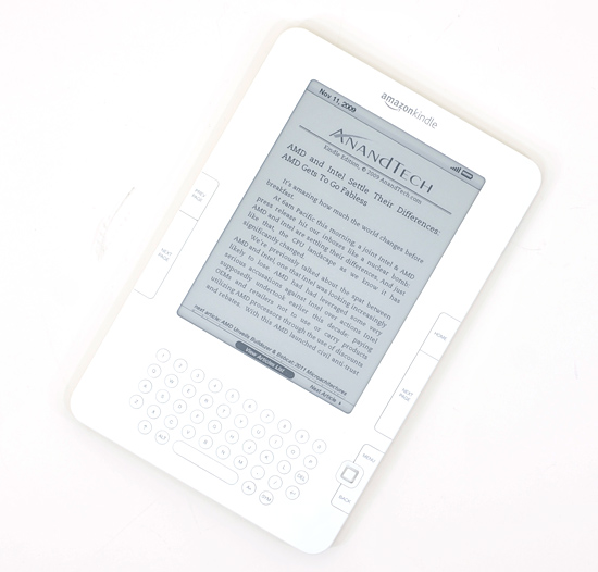
Next on the Agenda: AnandTech is now Available on Amazon Kindle Devices
I'm a Kindle 2 owner and I have to admit, it's sort of exciting seeing AnandTech on the device. Our 10 most recent articles are available for reading (subscription required) on the Kindle through Amazon's Kindle Store. If you've got a Kindle, check it out.

The AnandTech Redesign
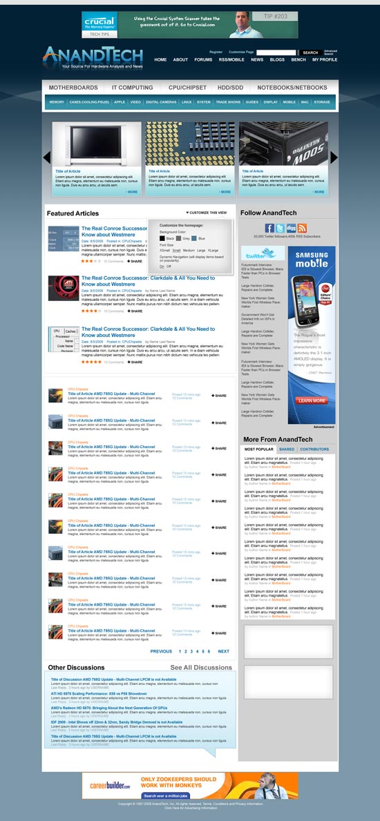
I mentioned this a while ago, but we're finally at a point where we can give you guys an idea of what's coming. Have a look at the new AnandTech and be sure to leave your feedback in the comments section. We haven't implemented it in HTML so there's still room to tweak.
Not all of the ad placements are in (something I want to get your input on shortly) and there's going to be a ton of customization options offered as well. So keep those two in mind. The main carousel up top with three big article images will actually automatically rotate through a set number of articles so you'll be able to get a good idea of the past several articles on the main site without any scrolling.
Our main goal here was to make the site look and feel a lot more modern, as well as bring its functionality where it should be for 2010. There's a lot of cool stuff coming with more giveaways, more content and more categories of Bench next year. Here it is, constructive criticism is always appreciated :)
Coming Soon: A Call for Writers
It's a bit premature but I just wanted to give you all a heads up that we'll be looking for some new writers in the near future. If you've ever wanted the chance to get into the industry, it may be time to start polishing off your writing skills. Get those writing samples ready folks!
More details soon...
Anand Goes to India?
From 12/1 - 12/15 I will be traveling to India for the first time in 10 years. If you're an AnandTech reader in/around Mumbai, Delhi or Jaipur let me know. If we can get enough folks together we might do a reader meetup :)


97 Comments
View All Comments
diehlr - Sunday, November 15, 2009 - link
I gotta say, I am liking the redesign less and less the more I look at it. There's just way too much dead space and padding around everything. The DailyTech news articles on the left definitely need to stay, and Twitter comments should not have their own column on the front page. If you really feel Twitter is necessary, make a click-to-expand section for them, but devoting that much room seems like a poor choice.mi1stormilst - Sunday, November 15, 2009 - link
1.) Yucky poo on the huge Twitter section, I don't use it, don't want to look at it and see little value in the huge section for it. People want twitter give them a link and leave the rest of us alone.2.) I hate ads at the very top of web pages, if you must do this please don't do it on the home page.
3.) I like the idea of seeing a snapshot of the most popular threads, should be like the top 10 excluding the random discussion type threads.
4.) Featured articles should be like the three most recent in each categories.
5.) New logo is okay, reminds me of Engadget or a blog of some type. Can we do better?
code255 - Sunday, November 15, 2009 - link
Please don't sheepishly change the Anandtech logo to make it "omg Web 2.0!"-ish by adding that reflection below it. That's so lame and unoriginal by now, as like 90% or the websites on the Internet copy that style.icrf - Sunday, November 15, 2009 - link
Is that the de-facto modern design or something? It looks almost exactly like ArsTechnica.com's most recent redesign.reinkarnation16 - Sunday, November 15, 2009 - link
Thats awesome! :Dstash - Saturday, November 14, 2009 - link
Will the new site get rid of the head scratching way you currently introduce stories? You always have a sentence or two that describes the story, but it trails off into an elipse. That's fine, but when you click into the story, that sentence is nowhere to be found.It makes no sense.
PyroHoltz - Saturday, November 14, 2009 - link
Congrats to the i7 winner! Have fun with the system and be sure to put it to good use. As for the site redesign, looks good Anand, looking forward to seeing it live. Have a good time in India, be sure to hello to a few Dell CS reps while you are there.rs1 - Saturday, November 14, 2009 - link
I thought the kindle had built-in wireless Internet? If so then why would someone pay for an anandtech subscription through the Kindle store when they could just point its browser at the website for free?William Gaatjes - Saturday, November 14, 2009 - link
I hope there will not be to much flash ads either( I hope none).Or a flash animation when clicking a picture.
JonnyDough - Saturday, November 14, 2009 - link
I think you meant polishing up, or dusting off?