The iOS 8 Review
by Brandon Chester on September 17, 2014 1:00 PM ESTMessages
According to Apple, Messages is now the most frequently used application on iOS. That's hardly a surprise considering the way most people use their smartphones (e.g. texting), so let's quickly discuss some of the changes. While Apple is fairly limited in terms of building on top of the SMS protocol, they have free reign to do whatever they wish with their iMessage platform. Because of that, feature additions for iMessage conversations and their accompanying design alterations are what make up most of the changes to Messages in iOS 8. That being said, there are a couple of additions that work for both iMessage and SMS conversations so it's best to talk about those first.
The core interface of Messages remains the same under iOS 8. Much like many other areas of the OS, the visual improvements are refinements to the interface rather than the drastic overhauls that we saw with iOS 7. For example, sending and receiving photos in a conversation features larger preview bubbles that stack atop one another when sent in succession. While this is a very minor design change, the resulting effect looks much nicer than on iOS 7 where each image was given a separate bubble with all the corners rounded off. This change also applies to videos sent in a conversation.
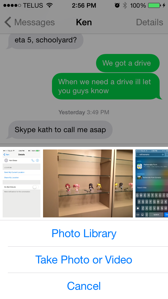
The photo picker is also greatly improved. Apple has added a scrollable list of recently taken pictures to make it easier to quickly share them. For older pictures the button to open up the Photos app interface is still present, as well as the button to take a new photo or video.
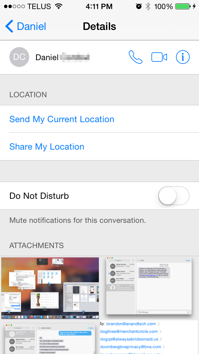
The contact button in the top right has been replaced with a details button. In addition to displaying buttons to call a person or view their full contact information, this new screen also has a switch to mute notifications for that conversation and a list of all media attachments that have been sent. For iMessage conversations there are also options to add users for group conversations, remove yourself from a group, assign a name to a group conversation, and to send location information in a vCard file with a message displaying a preview from the Apple Maps interface.
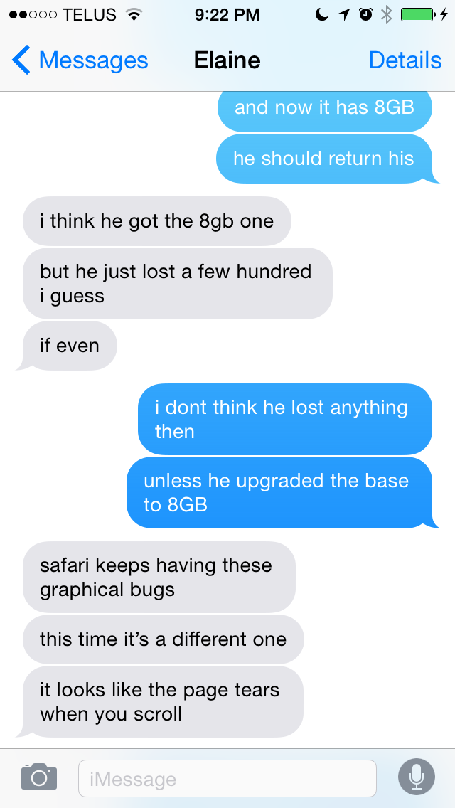
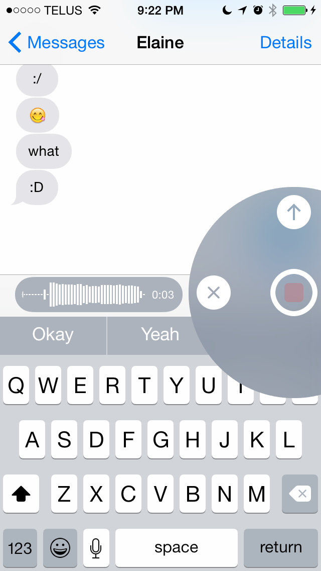
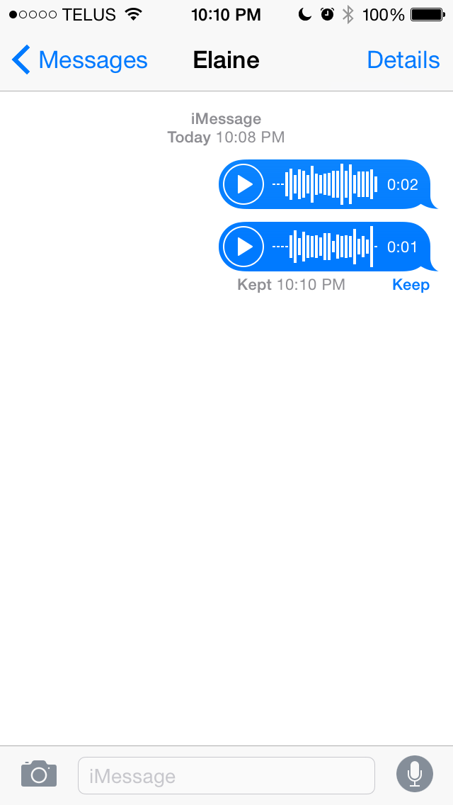
Things get more interesting once you take a look at what else Apple has done with iMessage. iMessage has the inherent advantage of being integrated into the stock Messages application. Apple is able to build in features to compete with other platforms while keeping the user in a familiar interface that includes all their SMS messages and iMessages. As you can see in the above screenshots, when the user has not typed anything into the input field the send button is replaced by a microphone. By holding down the microphone a user can record a voice message. The interface does feel a bit foreign at first, but essentially as long as the user is holding down the microphone button, the message will continue to record. If the user removes their finger while it is over the arrow it sends the voice clip instantly, while removing it when over the X deletes it; anywhere else gives the user the option to play back the clip before sending.
Holding down on the camera icon brings up the same sort of interface, although it works slightly differently than with recording audio clips. Once the user brings up the camera interface they no longer need to keep holding their finger down. Tapping the camera icon within the circle takes a photo, while holding down the red button takes a video recording. With the photo option there's no confirmation before the photo is sent so users who want to make sure they're sending a good photo should use the traditional button for taking photos and videos, which is accessed by tapping the camera icon in the Messages app rather than holding it down. One thing to note is that the photos taken with the new quick photo and video interface use a 16:9 sensor crop and scale, and have a resolution of 1920x1080.
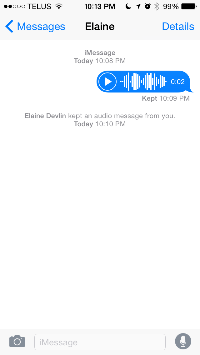
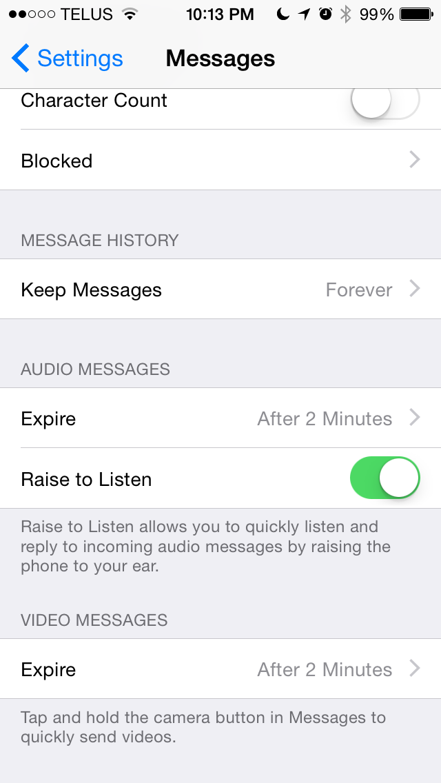
Since these features are meant to compete with other apps for sharing photos and videos like Snapchat, they wouldn't be complete without features for self deletion and for notifications when they're saved. By default, all audio and video messages sent will delete themselves after two minutes. Users can also set them to remain forever. In both cases, the user who sends the file and the users that receive it are given the option to watch/listen to the file and to keep it. Both actions send a notification to the sender, much like how Snapchat notifies users when someone takes a screenshot of a photo or video they send. Even after the message has deleted itself in the sender's conversation thread, if another user saved it there will be a notification and a time stamp to let the sender know.
As far as features go, iMessage and the Messages app are pretty much on par with every other messaging service. I do wish that Apple would add the ability to link accounts from other messaging services like you can with Messages on OS X. Having Messages become a central hub for Facebook, Hangouts, iMessage, and SMS would clear a number of applications off my phone. The risk that the dominance of the Messages app would crush the apps from other manufacturers may be exactly why Apple hasn't added such a feature yet.
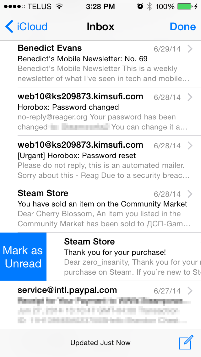
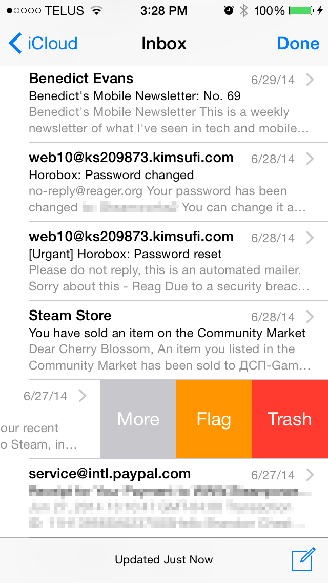
The Mail application receives some much needed usability improvements in iOS 8. Apple has implemented new swipe gestures for managing email. On iOS 7 swiping an email to the left would bring up an option to move the message to the trash as well as a menu labelled "More" that contained additional options like marking as unread, flagging, and moving to another mailbox. iOS 8 makes some of these options easier to access by giving them gestures rather than putting them all in a menu.
As you can see above, swiping an email to the right now brings up a button to mark as read/unread, and swiping to the left now contains the option to flag an email. Swiping to the very left edge of the screen now deletes an email without having to press the trash button. In practice this gesture is helpful but can sometimes result in unintentionally deleting an email, and so having an undo button show up temporarily after deleting an email like Google does with Gmail on Android would be a nice tweak to add to Apple's Mail app.
A simple swipe down moves the email draft to the bottom of the screen
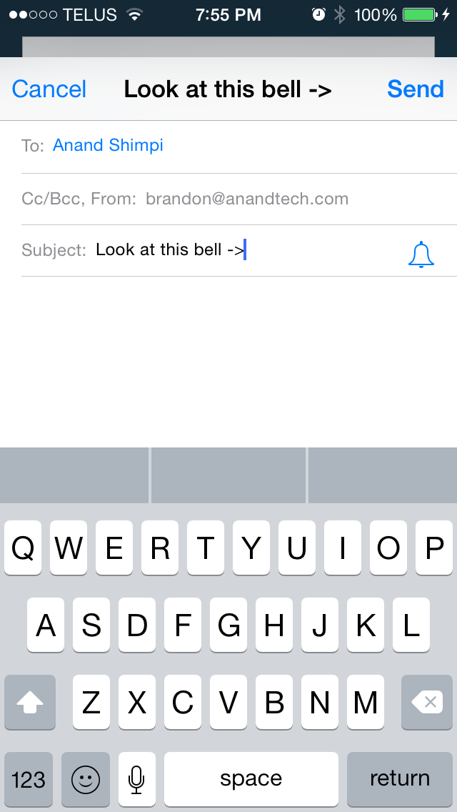
Apple has also included a new feature for thread specific email notifications. By default, iOS does not give individual notifications for emails that arrive. While this still remains the case on iOS 8, when composing an email an icon shaped like a bell will now appear in the subject field. The bell allows the user to enable notifications for a specific email thread without having to enable notifications for every single email that arrives. This can be useful when waiting for a reply to an important conversation, without having to also be notified about unimportant emails and spam that may also arrive in the interim.
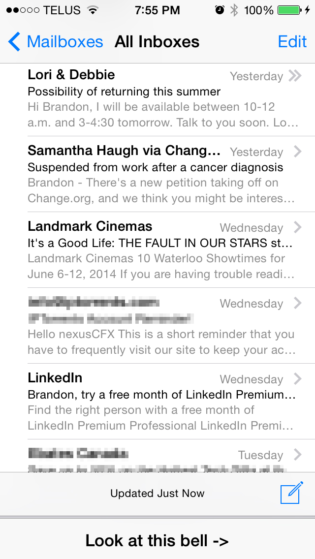
Composing your own emails is also improved in iOS 8. The Mail app now renders over the device's wallpaper, much like the tabs in Safari and the Reminders app. Above you can see that email drafts are now cards that pop up in front of the mailbox, and they can be swiped down to grab or reference content from other emails without having to save and close the draft. This can be a real time-saver when you just want to quickly grab a photo from another email to insert into your own.
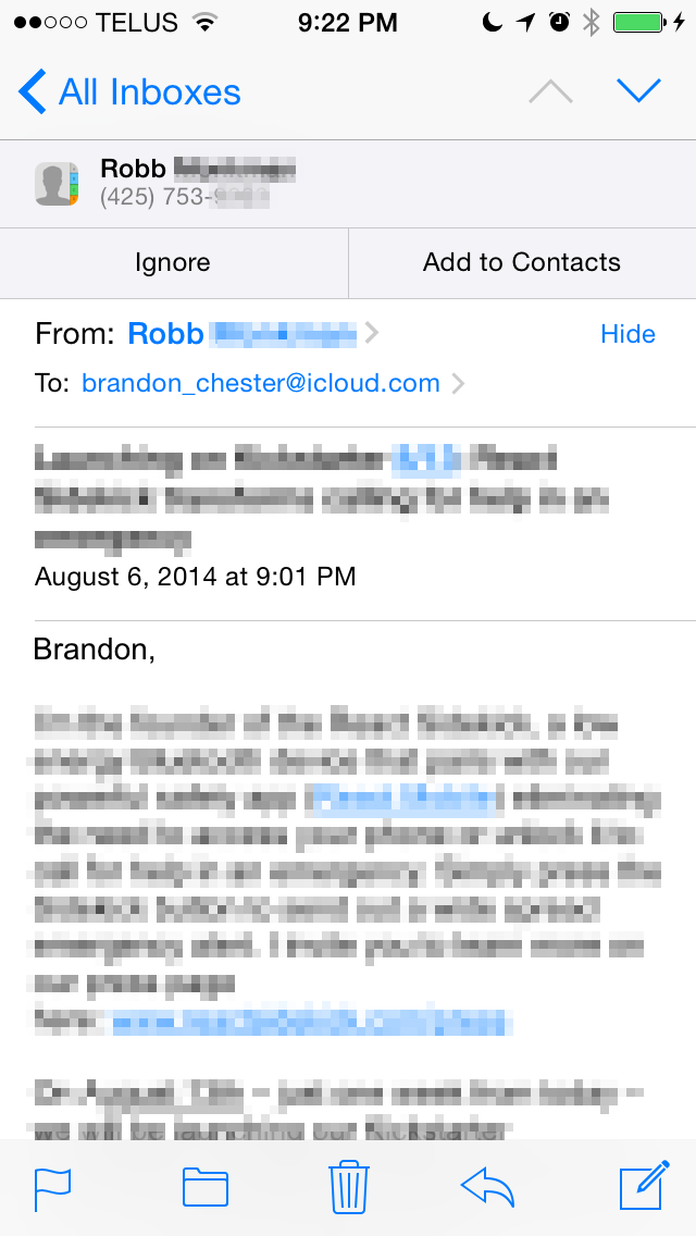
In the rightmost screenshot above you can see that Mail is also much smarter in iOS 8. The app can grab content from an email and give suggestions for things like new contacts and calendar appointments. As it stands, the email app on iOS 8 has most of the features I want in an email app. The one thing I would like to see added in the future is the app's ability to pick out information from emails extended to finding the unsubscribe link in spammy emails to be displayed at the top.
Recent Contacts
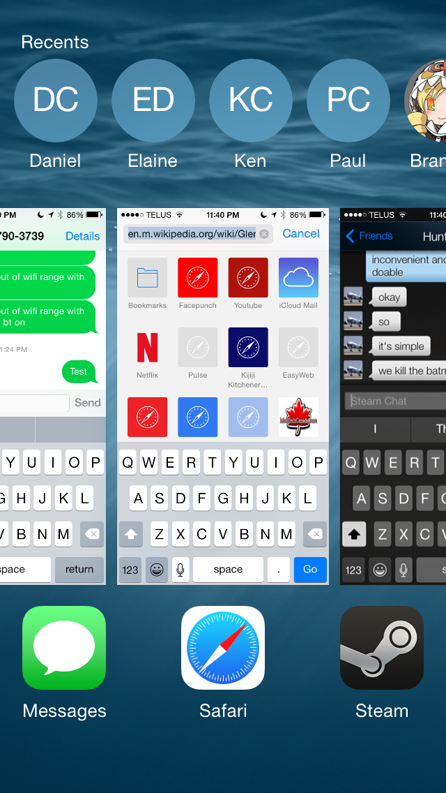
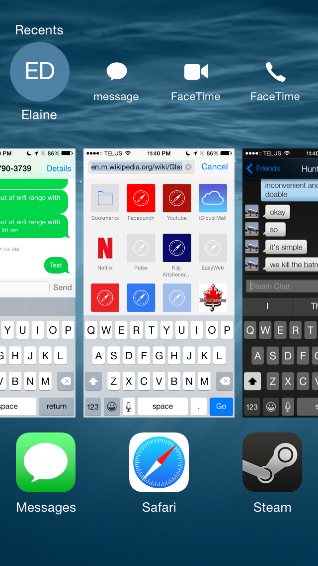
Recent Contacts, or "Recents" as Apple is calling them, is a new feature built into the iOS multitasking tray. Essentially the feature acts as a way to quickly contact people you talk to frequently. Optimally, each circle would have the person's contact photo, but in my case most just display the person's initials. Selecting someone's circle displays all the methods of contacting them that you have on file. If someone is frequently communicated with but not added to the iOS Contacts app, they will not appear in the Recents section of the multitasking tray.
Above you can see how the contacts are displayed and how clicking a list expands showing the different methods of communication. In theory this seems like a nice feature addition, but in practice I've had two issues, although both really stem from one main issue. The issue is that I don't find myself using the Recents list to contact people; I just go straight to the application I normally use to contact them. This is because every iOS app for communication has some form of built in contact list or history, so I can just as easily access the people I've recently contacted from within the app itself as I can using Recents. In my use case this makes the recent contacts list redundant, and I'm not sure how much use it will see with other iOS users. I've personally never felt a need for it.






164 Comments
View All Comments
NetMage - Monday, September 22, 2014 - link
With both iPhone and iPad logged into same Apple account, in iPad WiFi you should see the iPhone Hotspot as a choice - selecting it will activate the iPhones hotspot and then connect to it.soryuuha - Wednesday, September 17, 2014 - link
so..can you finally send any file over bluetooth?Impulses - Thursday, September 18, 2014 - link
Huh, you couldn't before? I guess I haven't really sent anything over BT since I had a dumb phone. Actually I sent stuff over BT from my first Android phone to other dumb phones for a while (ringtones mostly), seems like a pretty antiquated method to do anything now... Then again, Inge been using NFC for similarly basic stuff for like two years now. ;)SirPerro - Thursday, September 18, 2014 - link
"Many of the improvements are in areas of the OS that have long needed to be improved or changed. There are also number of additions that take a great amount of inspiration from other mobile operating systems. While this may be seen as copying by some, for users the end result is that their experience is improved and they have features they did not have before, which is what really matters."That wasn't what mattered in the multibillion lawsuits Apple filed in the past, right?
SirPerro - Thursday, September 18, 2014 - link
The whole "update the OS to update the email app" thing is reaching to android 1.6 levels of stupidityNetMage - Monday, September 22, 2014 - link
iOS updates are differential. Putting all updates on the same schedule has its advantages, and iOS development is still a fairly small team.bigstrudel - Thursday, September 18, 2014 - link
Clean install iOS 8 on the 5S gave me 6280 on Octane. And I never got 5700 (Low 5000's at best) on iOS 7. There's a lot more improvement here than indicated in your review.NA1NSXR - Thursday, September 18, 2014 - link
I don't know why the conclusion is so tempered. iOS7 was a terrible release that was basically a physical makeover with very mixed results for usability. iOS8 looks like a solid step forward for features and usability on a platform that needs a lot of these things being introduced. I am staying behind until a JB is released or until I take delivery of my new device but considering the ecosystem this is one of the biggest releases in many years.solipsism - Thursday, September 18, 2014 - link
I love being able to make and receive phone calls on my Mac but I have 4 issues with it. Some severe while others are just annoying.1) The speed at which the iPhone starts ringing and Mac starts ringing needs to be more in sync. The same goes for after you pick up one of the other. Perhaps a small, more efficient communication protocol for letting each device know what about the session.
2) You can make or receive a call on the Mac and then hand it off to the iPhone by pressing the top bar on the iPhone. This does not work the other way. Why doesn't it work the other way?
3) There is no dialer pad for the Mac so if you make or receive a call that requires you to press buttons for an automated system you have to then grab your iPhone and go to the Phone app and then the dialer pad to input the keys. You also have to makes to do this without pressing the top bar or it will disconnect from the Mac and you'll be using your iPhone for the duration of that call.
4) The app that open on the Mac says FaceTime in the Dock. Not a deal breaker by any means but it just all looks sloppy and incomplete.
PS: Am I the only one that still doesn't fully grasp what is considered Handoff and what is Continuity. Is it a unified term "Handoff and Continuity"? I'd think continuity is what has existed for years now with iCloud syncing data between apps, but handoff is the evolution of that to actually have the app show up in the Dock (Mac) or Fast App Switcher (iOS) to be clicked.
NetMage - Monday, September 22, 2014 - link
Continuity enables not just syncing data, but syncing state as well (e.g. editing a document on one device, switching to the other device and picking up at exactly the same place).