Google Updates Gmail With Material Design and Support for IMAP and Exchange
by Brandon Chester on October 31, 2014 11:30 PM EST- Posted in
- Smartphones
- Android
- Gmail
Google's applications like Gmail, Camera, and Chrome are likely applications that came on your Android phone when you first purchased it. But unlike iOS where Apple has to ship an entire operating system update to update an application, Google's apps for Android can be updated right from Google Play. Google has been steadily updating their applications to take advantage of their new "Material Design" design principles that were shown off at Google I/O. With Android 5.0 Lollipop on the horizon, Google has to get the remaining applications up to date, and the latest application to recieve the new visual style is Gmail with its major update to version 5.0.
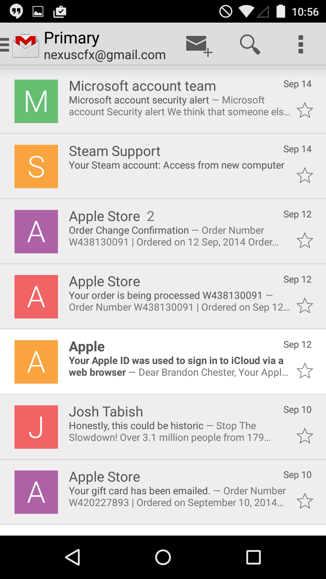
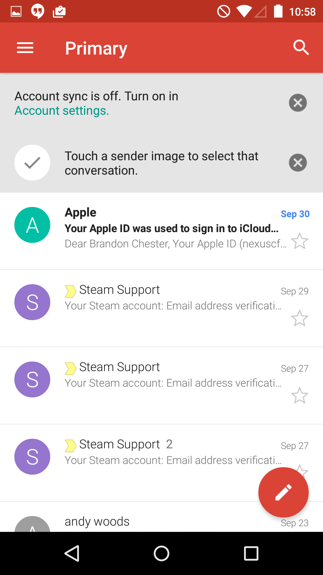
As you can see above, there's a lot of changes that come with the new Material Design interface. The most striking change is the the removal of the grey that was prevalent throughout the application. In the previous version, the color of an email preview changed to grey to indicate that the email had been read, while unread messages remained white. In the new design, the change between bolded or unbolded preview text indicates whether a message has been read. I personally find this to be much more aesthetically pleasing.
The header and status bar are now a nice moderately saturated red color that doesn't feel gaudy but brings more color into the interface. The circular button for composing a new email at the bottom also uses this red color. On the topic of circles, Google has begun to use circular contact photos throughout their applications, although in my case they just display the sender's first initial. If I had put in the effort to assign contact photos the new circles would display them where the squares previously did.
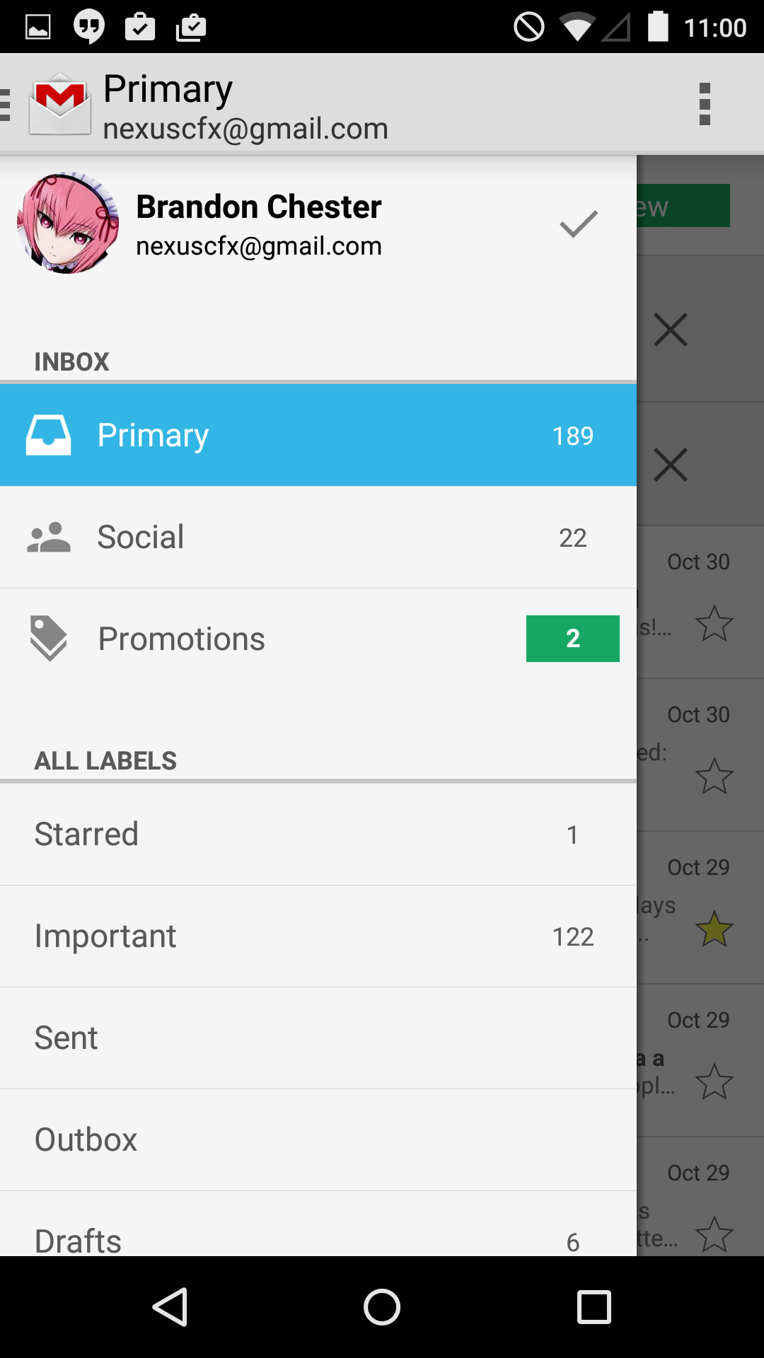
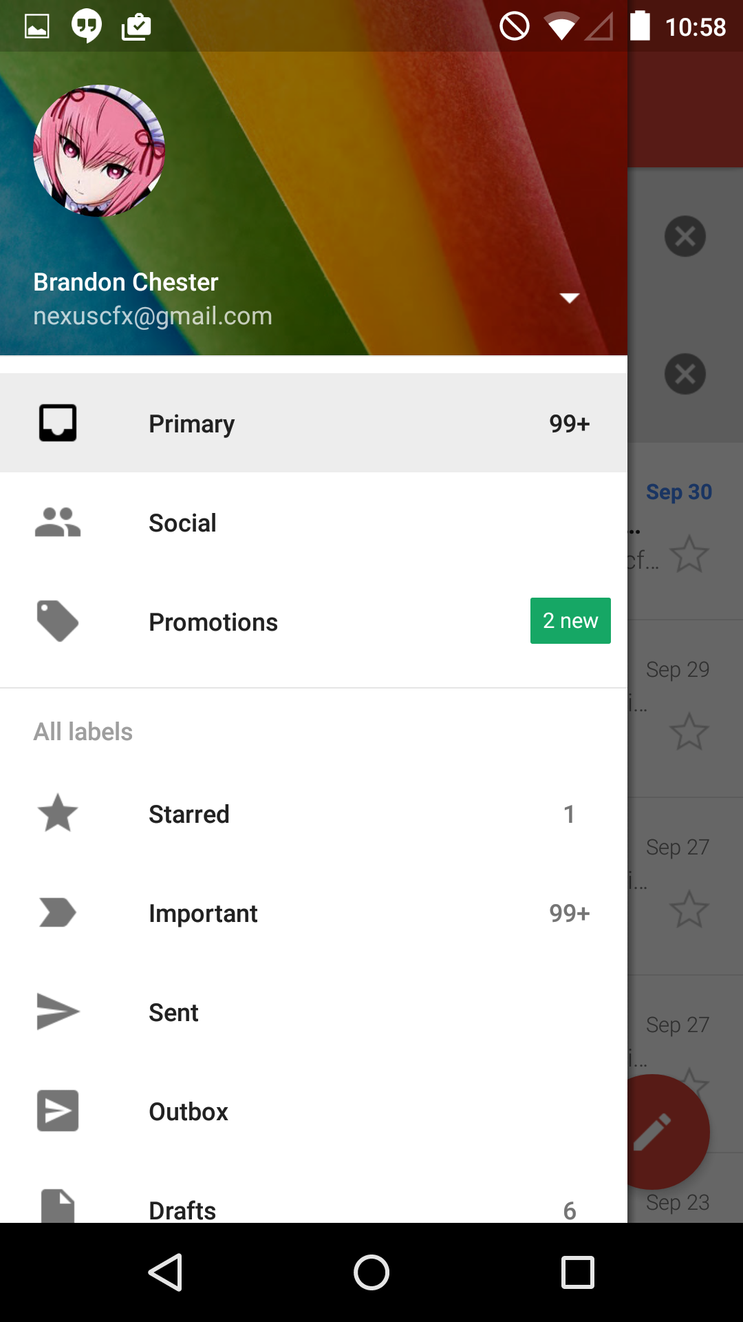
Google has also redesigned the navigation drawer that houses your different inbox labels, and settings. The grey has been changed to white, and the top displays your cover photo from Google+ which seems to be a message from Google that you're supposed to change it from the default rainbow thing.
The sliding drawer is a topic of debate right now because many applications implement it incorrectly, including many that are made by Google like the Hangouts application. Google's official guidelines state that the drawer is to slide in overtop of every other part of the interface except for the status bar. The new Gmail application implements this correctly, and I'm hopeful that every other Google application will be updated to adopt the proper design before Android Lollipop ships. It's very difficult to get developers to follow design guidelines when you don't set a good example with your own first party applications, and the navigation drawer in Hangouts has multiple issues with its design when compared to Google's guidelines.
The last big change in the application is the support for adding email accounts from other providers like Yahoo, iCloud Mail, Outlook, etc. Any email account that supports IMAP/POP or Exchange can be added. This is a great feature as it eliminates the need to have to add every non-Google email account to the standard Email application which isn't given as much attention as Google's own Gmail app.
Source: Android Police


35 Comments
View All Comments
soccerballtux - Saturday, November 1, 2014 - link
seriously. I don't get what the point of larger screen is-- so you can just update to use less space?Klug4Pres - Saturday, November 1, 2014 - link
Is "Conversation View" still compulsory? I won't use an email app that can't display - or allow you to delete - individual email messages.purplestater - Saturday, November 1, 2014 - link
I also loathe Conversation View. It's never been cumpulsory in the web interface; I'm surprised it would be so via the app.Klug4Pres - Sunday, November 2, 2014 - link
Actually, it was obligatory in the web version until on or about 29 July 2010, and still is in the Gmail app.purplestater - Sunday, November 2, 2014 - link
I don't remember the dates involved, but I had Conversation View turned off the same day it became an official change.merikafyeah - Saturday, November 1, 2014 - link
Ferris Nyan Nyan!RYF - Sunday, November 2, 2014 - link
Brandon, I can see that you have ordered a Apple Store Gift Card there, lol. You may wanna hide your order#/email.Brandon Chester - Sunday, November 2, 2014 - link
I didn't bother to blur it out because I used it a long time ago.jocke92 - Sunday, November 2, 2014 - link
Google is like Microsoft. Developing more than one software/app/service for the same service.They're approaching different people/markets, but got one or two unique feuteres that should have been available to all. Why do they don't put their work into one service and limiting it with licences?ruggia - Sunday, November 2, 2014 - link
well, remember when Google tried to unify accounts using Google+? That didn't go well, did it?