HP Stream 7 Review: A $119 Windows Tablet
by Brandon Chester on December 19, 2014 8:00 AM ESTWindows On Tablets
It's sort of interesting how the Windows tablet experience is unknown to many people. I stated earlier that there's more of a focus on Android and iOS tablets than Windows ones. In fact, the Windows 8 experience in general is unknown to many people. Although Windows 8 was released over two years ago, it still hasn't gained significant adoption among Windows users, myself included. This means that the Stream 7 was actually my first real experience with Windows 8, used primarily with a touch interface and in the Modern UI.
Like many people, I don't feel that the Modern UI is well suited to desktops and laptops, and is aimed more at tablets. Since the Stream 7 is a tablet, I hoped that Windows 8 would be able to provide a good experience, as the alternative was accepting that Modern isn't really good on anything. The HP Stream 7 runs Windows 8.1, but I will refer to is simply as Windows 8 as 8.1 is a free upgrade much like service packs in older versions of Windows.
The Stream 7 can be used in both landscape and portrait orientations, and what's interesting is that unlike a 7" Android tablet where I feel compelled to use it in portrait mode, I prefer to use the Stream 7 in landscape. This may have something to do with Windows feeling more natural in landscape because of my experience using it on desktop and laptop computers that have widescreen monitors.
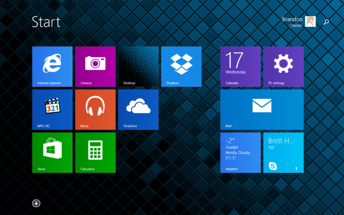
The big change for many users when going from Windows 7 to Windows 8 is the new full screen Start Screen that replaced the Start Menu from previous versions of Windows. The Start Screen is an area you will be spending a lot of time in when you use a Windows tablet. When you use Windows 8 on a traditional computer, many people use something like Start8 or Classic Shell to get back the old style Start Menu. Even if you aren't, you'll be spending a lot of time on the desktop. On tablets, the Start Screen is analogous to the home screen on iOS and Android, but it's more similar to Android's launcher implementation. It's a way to access all your full screen Modern UI applications, and so unlike a PC where you spend your time on the desktop, you spend your time on the Start Screen when you're not using an application on your Windows tablet.
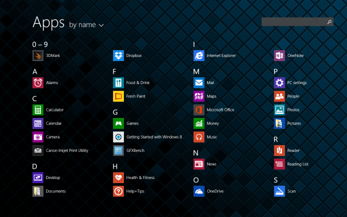
Swiping down or tapping the arrow in the bottom left of the Start screen brings you to the Apps Screen. This is a list of every application on the device and it replaces the "All Programs" section of the old Start Menu. You can see most of the default applications above, along with a few that I've installed. Windows 8.1 seems to come with most of the applications that you would expect to have by default on a tablet, and it even has some like a Calculator that Apple hasn't thought to include on the iPad after six generations.
Some good news about bloatware is that when you purchase the Stream 7 from Microsoft's store there isn't really any. Windows Signature Edition doesn't come with any 30 day antivirus trials, or manufacturer software to do things that Windows already does. (This is a good thing, as running a bunch of extra software on a 1GB Windows tablet would be truly problematic.) There are a couple of applications from HP relating to support documentation and registering your warranty, but these can be deleted and they only take up a few hundred megabytes. On that note, the Stream 7 comes with a bit under 19GB free out of the box, and I'll talk about storage management in a moment.
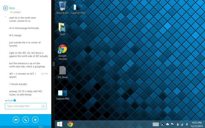
I think the split screen feature is an area where Microsoft is ahead of the competition by a large margin. The iPad has nothing that compares to this, and the multi-window support on some of Samsung's tablets is not implemented as well. Microsoft allows you to place two apps side by side, and the size of each can be adjusted by moving the bar that separates them. You can even put Modern UI applications next to the Windows desktop, which is a neat feature that you can see demonstrated above.
I think the implementation is a bit unintuitive though. To access it, you need to open your open applications by dragging in from the left, and then dragging back. This is a horrible gesture, because it's swiping somewhere and then reversing it, which would imply that the result is no change at all. Once you figure that out, you then drag your second application from the list and place it next to the one you currently have open. When you get the hang of it, it becomes very easy, but when I was first getting used to the tablet I found myself doing it by accident.
Unfortunately, the experience isn't without its issues. One of the things I've found difficult is managing storage. On an iOS or Android device, most of your files are stored within an application's container, so it's easy to manage storage by simply looking at how much space applications and their documents are taking up. Windows is more complicated, as it's a complete desktop operating system with a file system that users are intended to interact directly with on a regular basis.
When I add up all the space taken up by applications, documents, etc. in the storage section of the settings app, there is still space that is being used that I cannot easily trace. It can be difficult to keep track of every saved photo, video, document, etc. when they're not all forced into a specific application's storage location, and I suspect there are also hidden folders like Appdata with files taking up space from applications I have uninstalled. This problem applies more to desktop Windows applications than Modern UI ones, but it's worth noting because I think other users will end up having to deal with this as well.
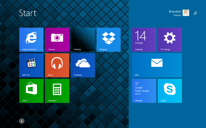
I've also encountered a few annoying software issues. One that occasionally pops up is what you see above, where there seems to be some issue with rotating my wallpaper that leads to a large area that matches the accent color I've chosen. I've tried to fix this by using different wallpaper dimensions, such as a native 1280x800 image, and a 1280x1280 image that should fit along the tablet's longest axis in any orientation, but it still seems to occur. Simply resetting the wallpaper or rebooting usually fixes the problem but it's worth pointing out. There are also times where applications or the interface itself will stop responding, which can be frustrating; it can be a painful reminder that you're running Windows.
As for the applications on the Windows Store, the experience ranges from good to really, really bad. Most of Microsoft's applications are very good, as expected. There are also third party apps like Dropbox that are just as good as on other platforms. But those seem to be exceptions to what I see as the theme in the Windows Store where applications fit into one of three categories:
- The app you want doesn't exist at all, with no first or third-party option.
- A first-party app exists, but it's either outdated compared to other platforms or just not as good.
- A third-party app exists, but it's missing features or doesn't perform well.
This is a serious issue, and at this point I honestly don't know how Microsoft can resolve it apart from trying to bribe developers. Twitter is a great example of an application that exists but is not as good as the version on iPad by any measure. I can't fault HP or the Stream 7 for this, but it is running Windows and it's a problem that will affect them even more than it affects Microsoft.
While there are tons of legacy Windows applications out there, the touch experience in the traditional Windows desktop interface is not very good. I find things difficult to tap, it's hard to fit Windows on the screen, and applications simply don't look or run as well as Modern UI ones.
This brings us to a very confusing situation regarding Microsoft Office. The Stream 7 includes 1 year of Office 365 with one PC license, one tablet license, and one smartphone license. The problem is, Microsoft doesn't have a touch optimized version of Office for Windows like they do for the iPad. Unless you hook up a Bluetooth mouse and keyboard, it's really hard to use the desktop Office client on a Windows tablet.
To me, this represents an oversight in Microsoft's product planning. The iPad is by far the dominant tablet in terms of usage share, and so it would make sense to target it due to the potential customers available. However, it means that Microsoft has prioritized another platform over their own. This does absolutely nothing to help the troubles that Windows 8 is facing. If Microsoft isn't going to make their own platform a priority, how can developers be expected to do so? Similarly, if Microsoft isn't going to support their platform, why should customers adopt it? By the time Windows 10 rolls around, Microsoft needs to improve the touch experience in the Windows desktop interface, and they need to make a touch optimized version of Office for the Modern interface.
Overall, Windows on tablets is something of a mixed bag. The interface translates better from PCs to tablets than I expected, and there are some well implemented features like split-screen multitasking, but there's still a lot of work to be done. Microsoft needs to improve the application selection quickly, and improved touch support definitely needs to be a priority.


157 Comments
View All Comments
victorson - Friday, December 19, 2014 - link
Hey guys, you are doing a great job, but I can't help but wonder why do you insist on reviewing those absolutely boring devices?! There's a ton of amazing smartphones out there (lots of great ones from China, for instance) that you have not examined, yet we get to read about the HP Stream 7 that no one in their right mind cares about.icrf - Friday, December 19, 2014 - link
I'm curious about Windows tablets. Not enough to buy a $500 version, but maybe enough to buy a $100 version. I'm more likely to do that than buy the latest Chinese flagship that's difficult to get stateside. I appreciate the review.tipoo - Friday, December 19, 2014 - link
Exactly - and the EFI is accessible on this just like a normal PC, so you can install Linux on it too. A 100 dollar experiment isn't bad either, if you want to toy around with Linux on a tablet.mczak - Friday, December 19, 2014 - link
Just a warning if you want to install linux on it. I'm near certain this device just like similar ones has 32bit UEFI (as it runs a 32bit version of windows), and no traditional bios emulation (csm). 32bit linux distributions do not support UEFI, and 64bit ones generally require 64bit UEFI. Not saying this can't work (it is indeed possible to get this to work), but unless some distros decide to support 32bit UEFI this is quite problematic.wtallis - Saturday, December 20, 2014 - link
Honestly, if you know enough about Linux to have a chance of getting something useful running on such a resource-constrained tablet, EFI's not going to slow you down, especially since kernel 3.15 and later support loading a 64-bit kernel from 32-bit EFI.miles_russell - Thursday, February 12, 2015 - link
HP Stream 7 is not very popular to consumer and if you look on a consumer base review (such as http://www.tabletstop7.tk/ my favorite...) its nowhere to be found.DracheMitch - Friday, March 27, 2015 - link
I don't really think that New Zealand is a target market for HP...DracheMitch - Friday, March 27, 2015 - link
That's funny that for Linux, this is considered "resource constrained", and that Linux would have such a hard time being able to boot on it, but for Windows, this is a pretty workable device.Why is Linux so bloated? What does it have the hardware support of a 1990 Macintosh?
ENEMY OUTLAW - Thursday, January 12, 2017 - link
Where can I buy onemetayoshi - Friday, December 19, 2014 - link
As a previous owner of an Acer Iconia W4, I'm actually more inclined to buy a Windows tablet in the $500+ range than any of these lower end devices now. I mean, I definitely enjoyed my time I had with the tablet, and I pretty much agree with the pros and cons of having Windows on a tablet. But knowing those pros and cons as a starting expectation, I just feel like Windows on a tablet can be so much more and not as limited once you start getting the 64-bit Windows with 4 GB of RAM or more and 128 GB NAND or more (a more "standard" Windows configuration) such as the currently available $700 Dell Venue 11 Pro (Core M version). With lower end Windows tablets, unfortunately, the common app standard is not there, and for what I wanted to do with a Windows tablet, my W4 was just not up to par. With more powerful tablets, I feel you can take advantage of having Windows on a tablet, which is, ironically, being able to use the billions of standard Desktop Windows applications. In fact, I'm very excited about Core M tablets, and I'm probably going to put down some money on a Core M device once more OEMs start updating their Windows tablets with it.With that said, I'm excited to see a Bay Trail tablet review finally on Anandtech. I hope that means with Core M on the way, more Windows tablet reviews will be done on all points of the spectrum, from the cheap Atom processors, to the low powered but mid-priced Core M tablets that hopefully come out (like the Dell Venue 11 Pro), to the high end Surface Pros.