ASUS PQ321Q UltraHD Monitor Review: Living with a 31.5-inch 4K Desktop Display
by Chris Heinonen on July 23, 2013 9:01 AM ESTAfter I published the initial grayscale dE2000 results for the PQ321Q, there was a lot of feedback over the quality of the numbers. The simple fact in the end is that only two of the numbers rose above the visual threshold of a dE2000 of 3.0. Yes, I would really like to see an average dE2000 of 1.0 or less, but the point of dE2000 is to tell us if we can see an error or not. With the exception of pure white, and even then just barely, the PQ321Q should look incredibly neutral without any calibration done to the grayscale. The gamma also tracks the 2.2 target very well, which will help to make up for the lack of depth in the black level.
Of course we want to calibrate the PQ321Q to see what it can really do. If you are buying a $3,500 display, you can likely buy, or rent, calibration gear to get it dialed in if you really care about image quality. And if you do, you are in for a treat.
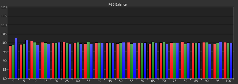

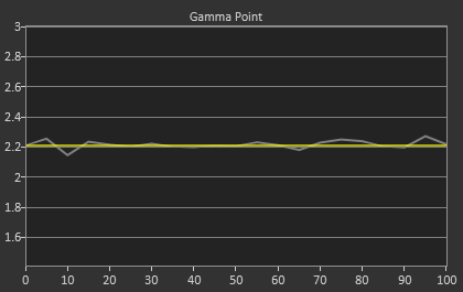
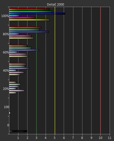
Post-calibration, our dE2000 average is now 0.56. We see every error below 2.0 except for 0, which really doesn’t matter anyway. There is no color shift, and the gamma tracks along 2.2 almost perfectly. Our contrast ratio has taken a small hit, down to 704:1 as it has to manipulate the peak white level to be more accurate. What we see now is a grayscale image that is basically flawless.
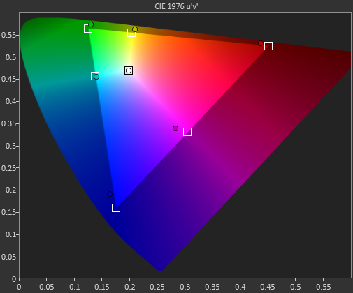
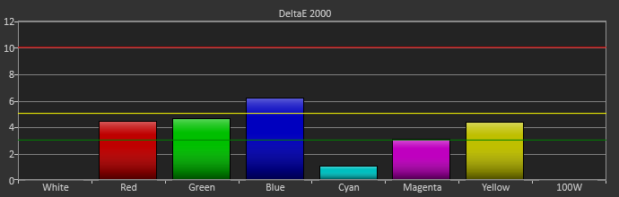
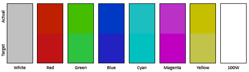
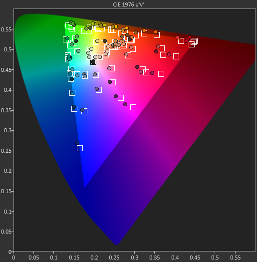
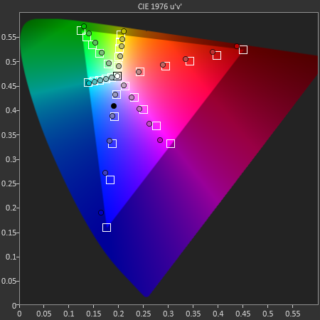
With color the PQ321Q has a pair of issues. The first issue is undersaturation in the gamut when it comes to red and blue. This also causes Magenta to be undersaturated, and brings out some high dE values for 100% saturations on those colors. We also see that green and red fall outside the sRGB gamut triangle. This too is unfortunate as it pushes yellows and oranges outside the gamut, and causes errors there. Our Cyan value is almost perfect, but every other color has some issue on the PQ321Q, at least at 100%.
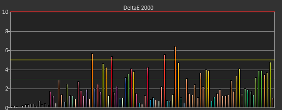
The reason we don’t just stop with the gamut charts is because they only represent 6 colors out of millions. They might have a large error, but it is rare to see 100% saturated colors in real content like photos or movies. To test this we use the Colorchecker chart in CalMAN. We’ve always used the Gretag Macbeth chart, which has 24 common colors on it. SpectraCal has added a 96-sample chart to the newest version of CalMAN. This adds more skin tones and other colors, and will provide a more accurate indication of monitor performance. The color samples for it are taken from an XRite chart. I’m going to run them both for a few reviews to see how it goes, but more samples leads to better accuracy, and lets us pinpoint exactly where things are going bad.
On the PQ321Q the issues all come back to Red/Orange/Yellow shades. Skin tones are good, blues and purples and cyans are all decent, and blue-greens are nice as well. Those tones that fall outside of the triangle cause the dE2000 average to rise way, way up and show us where the issues are. Reds certainly have a good amount of pop on the ASUS, and there really isn’t a good way to bring them back in. This issue is the largest one with the ASUS PQ321Q, as that extra gamut can’t really be addressed.
Traditionally if you look at the standard gamut dE2000 chart and see a large error in red, that indicates you will have issues with skin tones and people looking sunburned, With the larger Color Checker chart, we see that this is not the case, and that skin tones are, for the most part, under control while orange and yellows are not. This extra data helps us realize where the ASUS will look correct and where it will fall short.
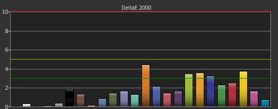
With the saturations charts, we see that the errors start small, like usual, and get larger as you move towards the edge of the gamut. Blue has the largest error, though we are less sensitive to blue than other colors. Cyan again remains great, and it would be nice if every color had the same performance as it does.
Post-calibration the ASUS is a bit of a mixed bag. We get great grayscale and gamma performance, but most people don’t just deal in black-and-white content. The color gamut provides a bit of an issue being both under-saturated and out-of-gamut at the same time. Looking through images the issue that pops out to me is the yellows. They really pop off the screen and look too bright. The color of reds looks slightly off, but yellow has the biggest issue that I can see with my eyes.


166 Comments
View All Comments
ninjaburger - Tuesday, July 23, 2013 - link
I feel like this is an easy position to take with very few 4k TVs in the wild, very little content delivered in 4k, and, maybe most importantly, *even less* content being finished at 4k (as opposed to upscaled 2.5k or 3k).When you see native 4k content distributed at 4k on a good 4k display, you can see the difference at normal viewing distances.
I don't think it's worth adopting until 2015 or 2016, but it will make a difference.
Hrel - Tuesday, July 23, 2013 - link
I see no reason to upgrade until 1080p becomes 10800p. Kept the CRT for 30 years, inherited the damn thing. That's how long I intend to keep my 1080p TV; whether tv makers like it or not.Sivar - Tuesday, July 23, 2013 - link
30 years? I hope you don't have a Samsung TV.althaz - Tuesday, July 23, 2013 - link
It doesn't matter what brand the TV is, good TVs last up to about 7 years. Cheaper TVs last even less time.DanNeely - Tuesday, July 23, 2013 - link
My parents no-name 19" CRT tv lasted from the early '80's to ~2000; the no-name ~30" CRT tv they replaced it with was still working fine ~3 years ago when they got a used ~35-40" 720p LCD for free from someone else. I'm not quite sure how old that TV is; IIRC it was from shortly after prices in that size dropped enough to make them mass market.Maybe you just abuse your idiotboxes.
bigboxes - Wednesday, July 24, 2013 - link
You must be trolling. My top of the line Mitsubishi CRT started having issues in 2006 in year seven. I replaced it with an NEC LCD panel that I'm still using today. It could go at any time and I'd update to the latest technology. I'm picky about image quality and could care less about screen thinness, but there is always options if you are looking for quality. I'm sure your 1080p tv won't make it 30 years. Of course, I don't believe your CRT made it 30 years without degradation issues. It's just not possible. Maybe you are just a cheap ass. At least man up about it. I want my 1080p tv to last at least ten years. Technology will have long passed it by at that time.bigboxes - Wednesday, July 24, 2013 - link
Of course, this coming from a man who replaced his bedroom CRT tv after almost 25 years. Even so, the tube was much dimmer before the "green" stopped working. Not to mention the tuner had long given up the ghost. Of course, this tv had migrated from the living room as the primary set to bedroom until it finally gave up the ghost. I miss it, but I'm not going to kid myself into believing that 1988 tech is the same as 2012. It's night and day.cheinonen - Tuesday, July 23, 2013 - link
I've expanded upon his chart and built a calculator and written up some more about it in other situations, like a desktop LCD here:http://referencehometheater.com/2013/commentary/im...
Basically, your living room TV is the main area that you don't see a benefit from 4K. And I've seen all the 4K demos with actual 4K content in person. I did like at CES this year when companies got creative and arranged their booths so you could sometimes only be 5-6' away from a 4K set, as if most people ever watched it from that distance.
psuedonymous - Tuesday, July 23, 2013 - link
That site sadly perpetuates (by inference) the old myth of 1 arcminute/pixel being the limit of human acuity. This is totally false. Capability of the Human Visual System (http://www.itcexperts.net/library/Capability%20of%... is a report from the AFRL that nicely summarises how we are nowhere even CLOSE to what could actually be called a 'retina' display.patrickjchase - Tuesday, July 23, 2013 - link
A lot of people seem to confuse cycles/deg with pixels/deg. The commonly accepted value for the practical limit of human visual acuity is 60 cycles/deg, or 1 cycle/min. The paper you posted supports this limit by the way: Section 3.1 states "When tested, the highest sinusoidal grating that can be resolved in normal viewing lies between 50 and 60 cy/deg..."To represent a 60 cycle/deg modulation you need an absolute minimum of 120 pixels/deg (Nyquist's sampling theorem). Assuming unassisted viewing and normal vision (not near-sighted) this leads to an overall resolution limit of 500 dpi or so.
With that said, the limit of acuity is actually not as relevant to our subjective perception of "sharpness" as many believe. There have been several studies arguing that our subjective perception is largely a driven by modulations on the order of 20 pairs/degree (i.e. we consider a scene to be "sharp" if it has strong modulations in that range). Grinding through the math again we get an optimal resolution of 200-300 dpi, which is right about where the current crop of retina displays are clustered.