Apple's iOS 4 Explored
by Anand Lal Shimpi on June 22, 2010 3:27 AM EST- Posted in
- Smartphones
- Apple
- iOS 4
- Gadgets
- Mobile
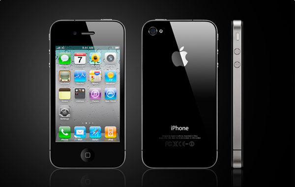
Steve Jobs stood on stage and proclaimed the iPhone 4 would be the biggest advancement since the introduction of the original iPhone. It’s a bit of a self fulfilling prophecy. Steve says it, folks get extra excited, and pre-orders go through the roof.
Granted it’s not all fluff. The faster SoC, smaller size and new industrial design are usually enough to sell a smartphone, much less a new iPhone. But add in a ridiculously high resolution display and you’ve got the potential for cool.

Yesterday the pre-launch festivities began with the official release of the fourth version of Apple’s mobile operating system: iOS. The new release, dubbed iOS 4, is available for the iPhone 3G, 3GS and iPhone 4 although it only offers the full set of features on the iPhone 3GS and iPhone 4. Unfortunately iPad users will have to wait until this fall to get the update.
The biggest features from an end user standpoint are the introduction of folders as a way of grouping apps together and simplifying your the iOS interface and of course, multitasking.
Folders
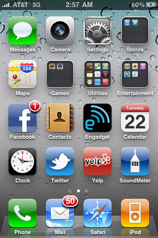
On my iPhone I have five screens of apps. That’s ridiculous. And as odd as this sounds, I can never find the flashlight app when I need it. When the iPhone 3G came out I mentioned that the simplicity of the iOS was being jeopardized. With apps and the new functionality Apple was trying to enable, everything got more cluttered. The original iPhone was a success due to how clean and efficient its UI was. While I believe that iOS3 still has the edge there, it’s one that is quickly eroding.
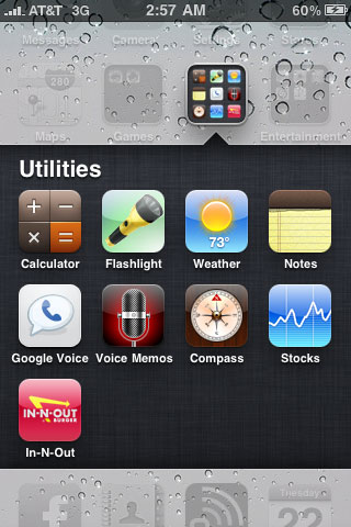
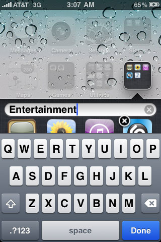
Folders is Apple’s temporary solution to the problem, and it seems to work. Press and hold your finger over an app icon on your home screen, wait for the icons to start jiggling, and then move one icon over another one. The two will form a group called a Folder and the Folder will be automatically named based on the type of apps in it. You can also rename the Folder.

A Folder in iOS 4

Renaming a Folder
With a bit of organization, I could reduce my five screens of apps down to two. With some pruning of unnecessary apps I got it down to one. Much better.

Like many features in iOS 4, Folders are both an improvement and a burden. The burden comes from the fact that you now have to tap, wait for a folder expansion animation and then tap again to launch an app in a folder. Folders also remain “open” until they’re closed. Meaning if you launch an app in a folder, when you return to the home screen you’ll actually end up in the last folder you were in. Hit the home button a second time to actually get to the home screen. I suspect this is a bug that Apple will fix however.
It’s also very easy to forget what you put in each Folder (you can store a maximum of 12 apps in a Folder). The Folders all look the same and although they give you a little preview of what’s inside it’s often difficult to tell. I’ve found that the best solution for me is to keep frequently used apps directly on the home screen but put everything else in Folders. Keeping everything on a single home screen also really helps keep things tidy and efficient. If you do have a ton of apps and can’t remember what folders you put them in, the Spotlight search is probably going to be even more important to you now than it has ever been.
I called Folders a temporary solution to the problem because eventually Apple will have to come up with new ways to deal with app and data organization, not to mention task switching. None of the features that show up in iOS should be a surprise, we’re seeing a repeat of the history of the PC, just in revised form. Apple and Google (eventually Microsoft as well) are looking to recreate the evolution of the PC not just in hardware but software as well, but they’re looking to do it without the mistakes. That’s why Apple is so adamant about defending its closed platform.
When we get true multitasking and once these mobile devices turn into active productivity devices rather than passive consumption devices then we’ll need much more than Folders. Remember the first time you saw the Start menu? You’ll probably get a similar feeling in the next few years on a smartphone OS.


46 Comments
View All Comments
jigglywiggly - Tuesday, June 22, 2010 - link
I haven't used my iphone 3g in a while. I have been using the Droid and HTC EVO 4g.These features have all been implemented better in Android anyway lawl.
Rnair - Tuesday, June 22, 2010 - link
I wonder why the other sites are not as objective! I understand IOS 4 and its pros and cons a bit better now :).medi01 - Tuesday, June 22, 2010 - link
I could only imagine how "objective" other sites are.Anand's site doesn't dare to display iSomethings in a bad light. Check recent article on android devices,
iphone is visible next to android phones, when it has advantage, but "incidentally dissapears" when it would look terrible (screen contrast).
What a shame... :(
deputc26 - Tuesday, June 22, 2010 - link
Yeah i noticed the selective presence of the iphone in that android review as well.Affectionate-Bed-980 - Tuesday, June 22, 2010 - link
You mean Anandtech only knows phones that are sold in the US? The rest of the phones fail to receive coverage. We all know how biased and limited the US cell phone market is. It only glances at part of the industry and only reveals part of the entire market. There's much more out there. Thank goodness for the N900 review, but honestly, if you want to do smartphones, do it like other sites do. Cover EVERY phone.medi01 - Wednesday, June 23, 2010 - link
No, being oriented to a particular market is ok for me.But showing iSomething when it has advantage (even when it is irrelevant), but "incidentally" hiding it (the author explained it like: "oh, it was probably in my pocket", that explains it, right?), when it sucks balls (contrast, for starters) is a shame.
So it seems that we have Mr Jobbs corporation, that sells a fraction of Nokia's market share, but that enjoys free, positive or very positive but god forbid negative, coverage in press.
I recall anand's site as rather objective (even though they seem to aggressively punch AMD quite a bit more than deserved recently, it was rather subtle, compared to what other sites do), so it's VERY frustrating, that it also bends to a Mr Apple's will.
:(((
Rnair - Tuesday, June 22, 2010 - link
I agree that the smartphone is getting more and more complicated. Good for us teck geeks :).But, Is it time to get back to the roots and introduce a version that is more basic, anyone for an iphone mini (an ala kin) ?
eirikma - Tuesday, June 22, 2010 - link
...then windows 95 is a cluster operating sytem. Even old versions of symbian does better than that.Any smart phone user who've tried using a computer knows that there are limits to how many thing you can do at once. When things stop working, you have to close down something. It is actually that simple - you don't have to "invent" absolutely everywhere.
SkullOne - Tuesday, June 22, 2010 - link
Yeah but this is Apple we're talking about. If they didn't invent or improve upon it then it sucks. ;) My Droid has never run out of memory with its multitasking and I have it doing quite a bit at times.Apple didn't do multitasking "the right way." They did it half-assed and claim that it's magically delicious.
All I can say is it's about time iOS finally caught up to Android...oh wait they're still behind because Android 2.2 is upon us bringing JIT compiler and Flash 10.1.
I'll keep my rooted, overclocked Droid with Froyo ROM thanks. Hope iPhone users enjoy iAds. AdMob in apps on my old iPhone 3G drove me insane, glad my Droid doesn't have that problem. It's nice actually having control over the hardware you pay for. ;)
sigmatau - Tuesday, June 22, 2010 - link
Multitasking is not at all what I expected and am very dissapointed. This is one feature I have been waiting for several months.I found the memory problem myself using Safari and multiple tabs. Some of the multiple tabs would dump whenever you scrolled through them, and then all of them would dump when you would switch to another app and back to Safari. I cleared out all the "multitasking" apps and opened up Safari again. I reloaded all tabs and they stayed fully loaded when I switched to a system monitor app to look at my memory.
Before clearing out the "multitasking" apps I had 5mb of free RAM. After clearing out the "multitasking" apps, I had 125mb free. They really, really need to give you the option to chose what to multitask. Why do I need Phone, Settings, Contacts, Clock to go in the "multitasking" bar? It makes no sense. Apple is 1 year behind others in implementing multitask and it surely is not as good as the competition.
I wont even go into being pissed that they haven't fixed the basic phone alert functions and other simple things you could do with most other free phones never mind smart phones.