Apple's iOS 4 Explored
by Anand Lal Shimpi on June 22, 2010 3:27 AM EST- Posted in
- Smartphones
- Apple
- iOS 4
- Gadgets
- Mobile
iPod App Changes
The majority of the iPod functionality of iOS remains unchanged. In fact, superficially the application’s appearance is the same as it was in iOS 3. The notable new feature here is the ability to finally create custom playlists on the fly without resorting to “on-the-go” playlists introduced with the 4th gen iPod - back before the age of touch screens. Honestly, I could never figure this feature out, so it’s nice to see real playlist creation coming.
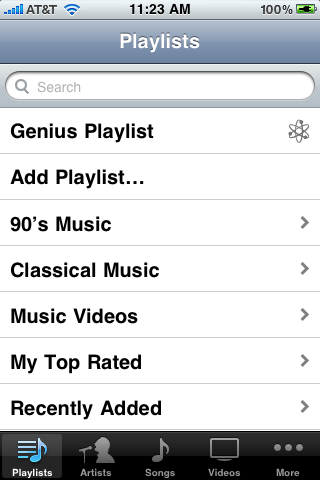
In the playlists tab, in the list of playlists, sits “add playlist.”
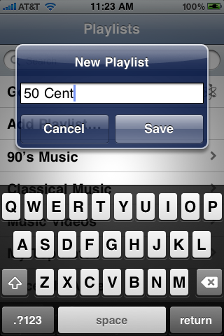
Clicking that brings up a creation name dialog box, and now you can start adding songs from your library into the playlist.
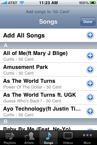
You can add virtually anything just by tapping the blue plus symbol, just like you’d expect from a real playlist anywhere else. Tap done, and it’s now a playlist which will sync back and forth across iTunes.
Tapping on the playlist you’ve created brings up the songs, videos, or media inside, where you can then edit, clear, or delete the playlist. Deletion and reordering is just like you’d expect it to be; delete with the red alert sign, reorder by dragging on the traction strip.
Control Changes
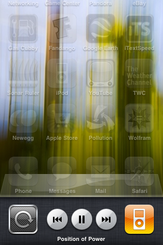
Of course, since iOS 4 brings multitasking, Apple had sacrifice one input gesture method for another to get you out of apps and into the task tray. Double tapping on the home button brings up a list of recently run applications and pushes your active window up. Swipe left in this list of apps, and you’ll be at the new iPod control interface.
The rightmost icon is the application which has current control of the audio stack; in this case, iPod. However, run Pandora Radio’s iOS aware application, and it’ll change to Pandora as expected.
The controls work just like you’d expect, including next and previous track, and pause.
Rotation lock is at far left, and is a carryover from its hardware toggle switch analog on the iPad. What’s puzzling, however, is that rotation lock only locks you in portrait mode. In fact, it seems as though iOS 4 intends you to only multitask in portrait mode, as bringing up the app switching tray in landscape results in the following:
Which is decidedly un-Apple given the garish combination of portrait icons plus titles, and landscape application UI here. Maybe in time Apple will make the icons rotate.


46 Comments
View All Comments
jigglywiggly - Tuesday, June 22, 2010 - link
I haven't used my iphone 3g in a while. I have been using the Droid and HTC EVO 4g.These features have all been implemented better in Android anyway lawl.
Rnair - Tuesday, June 22, 2010 - link
I wonder why the other sites are not as objective! I understand IOS 4 and its pros and cons a bit better now :).medi01 - Tuesday, June 22, 2010 - link
I could only imagine how "objective" other sites are.Anand's site doesn't dare to display iSomethings in a bad light. Check recent article on android devices,
iphone is visible next to android phones, when it has advantage, but "incidentally dissapears" when it would look terrible (screen contrast).
What a shame... :(
deputc26 - Tuesday, June 22, 2010 - link
Yeah i noticed the selective presence of the iphone in that android review as well.Affectionate-Bed-980 - Tuesday, June 22, 2010 - link
You mean Anandtech only knows phones that are sold in the US? The rest of the phones fail to receive coverage. We all know how biased and limited the US cell phone market is. It only glances at part of the industry and only reveals part of the entire market. There's much more out there. Thank goodness for the N900 review, but honestly, if you want to do smartphones, do it like other sites do. Cover EVERY phone.medi01 - Wednesday, June 23, 2010 - link
No, being oriented to a particular market is ok for me.But showing iSomething when it has advantage (even when it is irrelevant), but "incidentally" hiding it (the author explained it like: "oh, it was probably in my pocket", that explains it, right?), when it sucks balls (contrast, for starters) is a shame.
So it seems that we have Mr Jobbs corporation, that sells a fraction of Nokia's market share, but that enjoys free, positive or very positive but god forbid negative, coverage in press.
I recall anand's site as rather objective (even though they seem to aggressively punch AMD quite a bit more than deserved recently, it was rather subtle, compared to what other sites do), so it's VERY frustrating, that it also bends to a Mr Apple's will.
:(((
Rnair - Tuesday, June 22, 2010 - link
I agree that the smartphone is getting more and more complicated. Good for us teck geeks :).But, Is it time to get back to the roots and introduce a version that is more basic, anyone for an iphone mini (an ala kin) ?
eirikma - Tuesday, June 22, 2010 - link
...then windows 95 is a cluster operating sytem. Even old versions of symbian does better than that.Any smart phone user who've tried using a computer knows that there are limits to how many thing you can do at once. When things stop working, you have to close down something. It is actually that simple - you don't have to "invent" absolutely everywhere.
SkullOne - Tuesday, June 22, 2010 - link
Yeah but this is Apple we're talking about. If they didn't invent or improve upon it then it sucks. ;) My Droid has never run out of memory with its multitasking and I have it doing quite a bit at times.Apple didn't do multitasking "the right way." They did it half-assed and claim that it's magically delicious.
All I can say is it's about time iOS finally caught up to Android...oh wait they're still behind because Android 2.2 is upon us bringing JIT compiler and Flash 10.1.
I'll keep my rooted, overclocked Droid with Froyo ROM thanks. Hope iPhone users enjoy iAds. AdMob in apps on my old iPhone 3G drove me insane, glad my Droid doesn't have that problem. It's nice actually having control over the hardware you pay for. ;)
sigmatau - Tuesday, June 22, 2010 - link
Multitasking is not at all what I expected and am very dissapointed. This is one feature I have been waiting for several months.I found the memory problem myself using Safari and multiple tabs. Some of the multiple tabs would dump whenever you scrolled through them, and then all of them would dump when you would switch to another app and back to Safari. I cleared out all the "multitasking" apps and opened up Safari again. I reloaded all tabs and they stayed fully loaded when I switched to a system monitor app to look at my memory.
Before clearing out the "multitasking" apps I had 5mb of free RAM. After clearing out the "multitasking" apps, I had 125mb free. They really, really need to give you the option to chose what to multitask. Why do I need Phone, Settings, Contacts, Clock to go in the "multitasking" bar? It makes no sense. Apple is 1 year behind others in implementing multitask and it surely is not as good as the competition.
I wont even go into being pissed that they haven't fixed the basic phone alert functions and other simple things you could do with most other free phones never mind smart phones.