The Apple iPad 2 Review
by Brian Klug, Anand Lal Shimpi & Vivek Gowri on March 19, 2011 8:01 PM ESTThe Cameras
If there’s one thing that people were waiting for with the iPad 2, it’s the inclusion of cameras. CPU and GPU performance improvements with the iPad 2 are dramatic, but it’s the cameras that will drive both existing and new iPad customers to the device. For being probably the single most notable difference between the iPad 2 and its predecessor, the camera execution and experience on the iPad 2 is actually surprisingly bad.
I could pretty much sum up the iPad 2 cameras with one word: mediocre. The interface, the physical placement of the rear camera, and finally actual quality all leave room for considerable improvement. If you want a video overview of the entire iPad 2 camera situation, check out our video review.
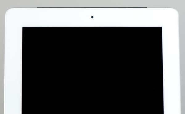
The front facing camera is actually about where it should be, in fact. VGA is standard fare for iOS devices because right now FaceTime is just 320x240 from iDevices. My issue isn’t with the front facing camera, it’s the back camera that really under-delivers, and for that reason the iPad 2 feels like it’s a device saddled with two front-facing cameras. The fact that they’re better than nothing (e.g. iPad 1) is small consolation for how seriously underwhelming the rear camera is.
Both cameras are identical to what comes in the iPod Touch 4th generation, a device that starts at $229. At $499, it doesn’t seem like a completely unreasonable thing to expect cameras that are at least somewhat better.
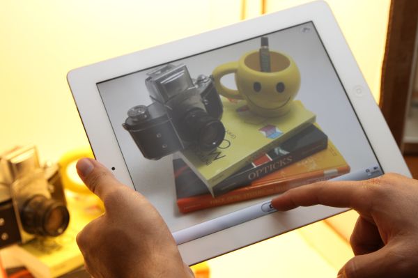
Let’s start with the camera user interface. At first glance, it’s the exact same as the camera interface on the iPhone and iPod Touch. Capture button in the center, a link to the photo application with thumbnail of the last captured photo in the bottom left, a digital zoom slider after a tap, and a switch between video and still at right. Up in the top right is the switch-front-back camera button as well. The iPad has no HDR options, and obviously no LED flash options either. Tapping on the preview exposes for the tapped region, but since the rear camera is fixed focus, focus doesn’t change.
What’s really annoying about this interface is that it rotates.
I’ve spent every second since first picking up the iPad 2 wondering what possessed Apple’s UI designers to make this decision, asking myself what possible benefits this choice could have. The only possible one is that this is an equalizer for left-handed users, but then why not simply make an option in settings to change the location of the bar from the left to the right side?
The problem with keeping the capture/switch bar at the bottom of each orientation is that it puts the capture button in the absolute worst possible place.
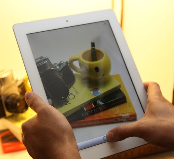
At each orientation, the capture button is dead center at the bottom. The result is that to tap capture, you need to either stretch your thumb all the way to reach it, or remove your hand and tap with the index finger.
Both of those result in a much less stable grip position and add to shake. Moreover, it’s a downright fatiguing position to have to hold the iPad in for any length of time. It’s somewhat annoying in portrait, but downright frustrating in landscape.
Putting the capture button here is painful. Were it left closest to the home button like it is on smaller iDevices, the capture button would be right near where the thumb naturally rests. Tap it with your thumb, and boom, no problem. Maybe a transparent button would also make sense.
The other problem with the capture interface is that if you have relatively large palms or tightly grip the iPad 2 to brace it and reduce shake, you run the risk of causing an unintended touch on the lower right or left corners. Numerous times, I went to hit capture and found that nothing happened. When that occurred, generally it was because I was touching the bottom left or right with my palm inadvertently. Touch filtering or heck, maybe some of that multitouch wizardry would go a long way here, Apple.
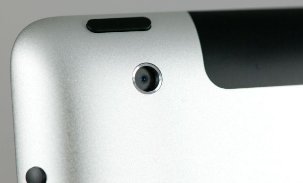
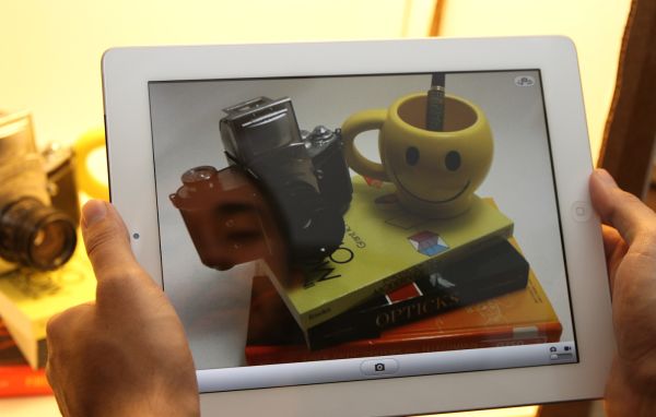
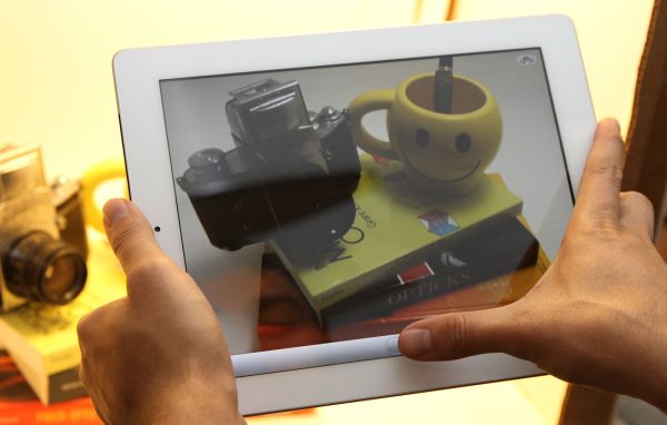
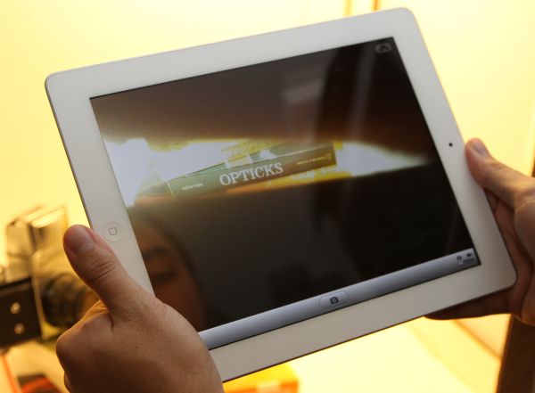
The final problem is with placement of the actual camera. Because of its position in the extreme top left (viewed from the back), the only viable way to hold the iPad 2 for landscape capture is with the home button on the right side. Hold it naturally with the button on the left side, and you'll end up blocking the camera with your hand like this:
The image preview in still mode is cropped to 4:3 and upscaled to XGA. The native resolution of the rear camera is 1280x720 (16:9). To get to 960x720 (4:3) Apple simply cuts off 160 pixels on the left and right. The fact that the image preview in still capture mode is upscaled to the full size of the iPad 2 display accentuates its underwhelming and noisy quality dramatically. It doesn’t look awesome. The front facing VGA camera blown up to XGA is even less impressive.
The only positive side effect of all this is that image capture is insanely quick. You can literally mash the capture button on both the front and rear cameras and capture essentially as fast as you can tap. No doubt some of that is the A5's impressive speed gains, but the other part of it is just the low resolution of those two cameras.






189 Comments
View All Comments
claytontullos - Saturday, March 19, 2011 - link
http://technabob.com/blog/2011/03/18/ipad-2-refrig... kind of fun?vol7ron - Saturday, March 19, 2011 - link
This just goes back to what I've said since the iPad was introduced. It'll be the +1 device that's best for laying around your house. This goes into my review as why it needs to hit the $200-250 price point.Sure it's a nice e-Reader and can entertain with some games and even allow for some production work, but it is still clunky and uncomfortable and to be efficient and productive you need the additional hardware, which are going to bring you in a nice laptop range anyhow.
The 3GS is hitting the $50-100 price point w/ a 2 year contract, which I suggested a year ago. Personally, I still think that should be the price w/o the contract (to be available after-market for gifts/presents), but as long it's available at that point, that's where it needs to be.
I still think the iPad needs to drop to that $200-250 point. It's the coffee table device, which people should consider having 2-3 spread-out in the home [ maybe one in the bathroom ;) ] - if only they could also self-sync wirelessly. I'm not too sure who buys the base model, but the specs alone would keep me from considering it and when you look at the higher spec'd models, it's not as justified when looking at laptops, or other eReaders.
solipsism - Sunday, March 20, 2011 - link
$200 to $250 for a newly released 10” Tablet with an IPS panel? WTF are you smoking? How can you have such an odd mental disconnect between writing that and then writing "The 3GS is hitting the $50-100 price point w/ a 2 year contract”? What part of 2-year contract aren’t you understanding? Do you not realize the carrier is paying Apple more than $200-250 for that 3GS, and you are paying the carrier a lot more than that over 2 years?Pray tell, how would this device be $200-250 when the competition with a 2 decade head start still hasn’t been able to compete on price?
synaesthetic - Sunday, March 20, 2011 - link
I don't get how they sell so many when they're so useless and clunky... and cost so much.Lot of hipsters I guess.
michael2k - Sunday, March 20, 2011 - link
The weight, battery life, and cost (altogether) are unparalleled in the computing world.Smartphones with similar performance characteristics have far smaller screens and lower battery life.
PCs with similar battery life cost far more and weigh far more.
PCs with similar weight (and still double at that) cost far more and have only fraction of the battery life.
PCs with similar cost weigh far more and have drastically lower battery life.
Meaker10 - Sunday, March 20, 2011 - link
A dual core sandy bridge 13" device is going to be far more useful for work and far more powerful.michael2k - Sunday, March 20, 2011 - link
Who said anything about work? For things like reading Anandtech it would be far heavier, bulkier, and with less battery life.bigboxes - Sunday, March 20, 2011 - link
Just admit that it's a toy. The authors laid it out for you on how they prefer to use other devices instead of the iPad. It too bulky for portability and underpowered for any productivity tasks.So, you're telling me (and everyone else here) that you paid $500+ just to surf AnandTech on your couch? Just wondering.
Stas - Monday, March 21, 2011 - link
That's exactly why it cannot cost this much to be a reasonable buy. No, the following purchases are not reasonable: fa- sheep base, soccer moms that buy the latest gadget with most hype for their kids/husbands not even knowing wtf it does, or PR boost in form of including, again, the most hyped device with cars, hotel rooms, air travel, etc (3 categories right there probably account for 90% of all sales). I mean people that understand exactly what the device is, what it's not, and have a clear idea of how they are going to use it. And it doesn't matter how much it costs to make it, how advanced the hardware is, or how "revolutionary" the design is. Given the limited usability of a slim, touchscreen device, I think asking $600+ for one is ballsy.MScrip - Monday, March 21, 2011 - link
-- "Given the limited usability of a slim, touchscreen device, I think asking $600+ for one is ballsy." --That's true about any tablet.
As great as Honeycomb tablets are... they're still not gonna provide a true computing experience.
A $600 laptop will always provide far more functionality than a $600 tablet...
Yet... all these manufacturers are pumping out tablets at an alarming rate.
Apple took the risk and added a new product to their lineup.
If tablets were destined to fail... we wouldn't see Motorola, Samsung and even RIM jumping into the tablet game...