Art Lebedev Studios Expands Optimus Line
by Jason Inofuentes on January 11, 2012 3:24 AM EST- Posted in
- Trade Shows
- CES
- CES 2012
- Art Lebedev
- Optimus Popularis
- Mini Six
Art Lebedev Studios premiered its Optimus Maximus keyboard in 2007; the device featured individual OLED displays for each key and provided a range of customizability never before seen in the PC input space. It also reached stratospheric heights in terms of pricing. The peripherals success has spawned an expansion of the line; first with the Mini Three and Aux (3-key and 12-key variants, respectively) and now with the Mini Six and the Optimus Popularis.
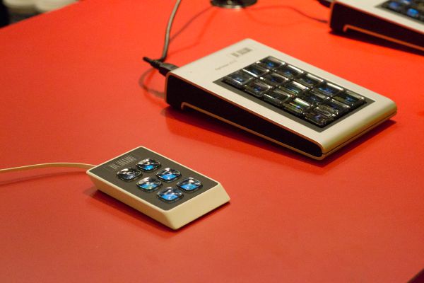
The Popularis is a full-sized keyboard that features the same customizability as the Maximus, with a few concessions in order to meet a lower price point (closer to $1,000 than $10,000). Of these concessions the most signficant is the elminiation of the individual OLED displays, in their place is a single LCD display, over which the keys are mounted. Beneath the Fn keys is a customizable display area that runs the full length of the device and can be used to show weather and stock information, or a design of your choosing. The keys are not as clicky and mechanically satisfying as its big brother, indeed I suspect key presses activate a capacitive layer between the display and the keyboard overlay.
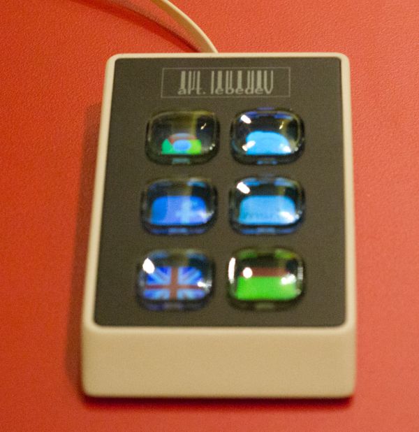
The Mini Six expands on the Mini Three's concept, but foregoes the OLEDs as well and opts for the single LCD display. The industrial design for both the Mini Six and Popularis moves away from the brushed metal and oversized nature of the Maximus, opting instead for glossy plastics and a certain degree of thinness. The design remains cohesive across the larger Popularis and the smaller Mini Six, and either would stand out on anybody's desk.
In the end, any Art Lebedev product exists in this high end space that's ideal for edge case creative types, or people that appreciate far-reaching design and have the wealth necessary to indulge in these products. Art Lebedev studios, though, sees no problem in pursuing this type of market, they've expanded their business to include a design office in New York and hope to put the Popularis and Mini Six in many more hands than the Maximus reached.


4 Comments
View All Comments
Cobra Commander - Wednesday, January 11, 2012 - link
That looks like crap.Looks like 1/2" between the screen of each button and the top of each button. That looks like someone from 1986 got a hold of some little tiny color screens.
etamin - Wednesday, January 11, 2012 - link
If it weren't for the gimmicky screen underneath, it would look even more like a child's fisher price practice keyboardgevorg - Wednesday, January 11, 2012 - link
The Optimus Maximus keyboard from 2007 is so much better than this crap. Art Lebedev should concentrate on how to reduce the price of Optimus, rather do these pathetic "lowend" variants.AnnihilatorX - Sunday, January 15, 2012 - link
They might as well use thin glass as in smart phone screens for each individual button,rather than have a huge rounded bumps of toy-like plastic.