ASUS PQ321Q UltraHD Monitor Review: Living with a 31.5-inch 4K Desktop Display
by Chris Heinonen on July 23, 2013 9:01 AM ESTAfter I published the initial grayscale dE2000 results for the PQ321Q, there was a lot of feedback over the quality of the numbers. The simple fact in the end is that only two of the numbers rose above the visual threshold of a dE2000 of 3.0. Yes, I would really like to see an average dE2000 of 1.0 or less, but the point of dE2000 is to tell us if we can see an error or not. With the exception of pure white, and even then just barely, the PQ321Q should look incredibly neutral without any calibration done to the grayscale. The gamma also tracks the 2.2 target very well, which will help to make up for the lack of depth in the black level.
Of course we want to calibrate the PQ321Q to see what it can really do. If you are buying a $3,500 display, you can likely buy, or rent, calibration gear to get it dialed in if you really care about image quality. And if you do, you are in for a treat.
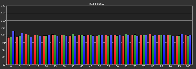

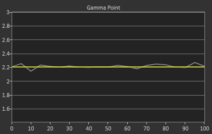
Post-calibration, our dE2000 average is now 0.56. We see every error below 2.0 except for 0, which really doesn’t matter anyway. There is no color shift, and the gamma tracks along 2.2 almost perfectly. Our contrast ratio has taken a small hit, down to 704:1 as it has to manipulate the peak white level to be more accurate. What we see now is a grayscale image that is basically flawless.
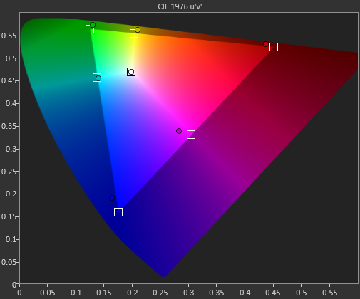
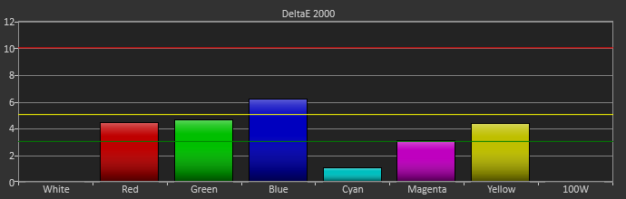
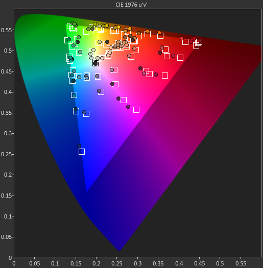
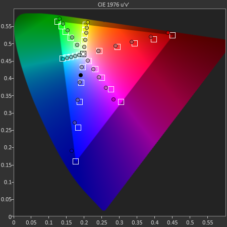
With color the PQ321Q has a pair of issues. The first issue is undersaturation in the gamut when it comes to red and blue. This also causes Magenta to be undersaturated, and brings out some high dE values for 100% saturations on those colors. We also see that green and red fall outside the sRGB gamut triangle. This too is unfortunate as it pushes yellows and oranges outside the gamut, and causes errors there. Our Cyan value is almost perfect, but every other color has some issue on the PQ321Q, at least at 100%.
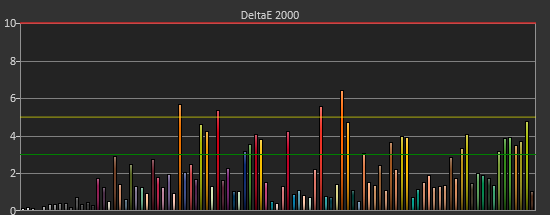
The reason we don’t just stop with the gamut charts is because they only represent 6 colors out of millions. They might have a large error, but it is rare to see 100% saturated colors in real content like photos or movies. To test this we use the Colorchecker chart in CalMAN. We’ve always used the Gretag Macbeth chart, which has 24 common colors on it. SpectraCal has added a 96-sample chart to the newest version of CalMAN. This adds more skin tones and other colors, and will provide a more accurate indication of monitor performance. The color samples for it are taken from an XRite chart. I’m going to run them both for a few reviews to see how it goes, but more samples leads to better accuracy, and lets us pinpoint exactly where things are going bad.
On the PQ321Q the issues all come back to Red/Orange/Yellow shades. Skin tones are good, blues and purples and cyans are all decent, and blue-greens are nice as well. Those tones that fall outside of the triangle cause the dE2000 average to rise way, way up and show us where the issues are. Reds certainly have a good amount of pop on the ASUS, and there really isn’t a good way to bring them back in. This issue is the largest one with the ASUS PQ321Q, as that extra gamut can’t really be addressed.
Traditionally if you look at the standard gamut dE2000 chart and see a large error in red, that indicates you will have issues with skin tones and people looking sunburned, With the larger Color Checker chart, we see that this is not the case, and that skin tones are, for the most part, under control while orange and yellows are not. This extra data helps us realize where the ASUS will look correct and where it will fall short.
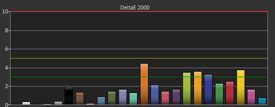
With the saturations charts, we see that the errors start small, like usual, and get larger as you move towards the edge of the gamut. Blue has the largest error, though we are less sensitive to blue than other colors. Cyan again remains great, and it would be nice if every color had the same performance as it does.
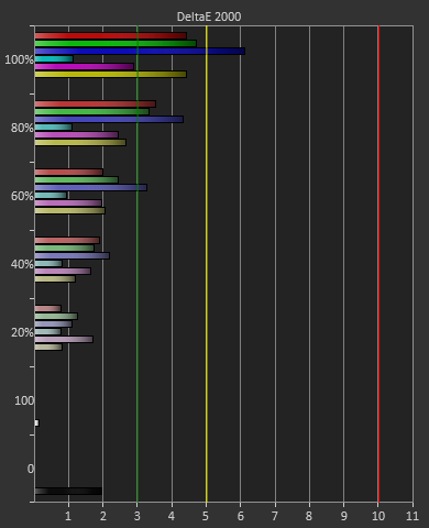
Post-calibration the ASUS is a bit of a mixed bag. We get great grayscale and gamma performance, but most people don’t just deal in black-and-white content. The color gamut provides a bit of an issue being both under-saturated and out-of-gamut at the same time. Looking through images the issue that pops out to me is the yellows. They really pop off the screen and look too bright. The color of reds looks slightly off, but yellow has the biggest issue that I can see with my eyes.


166 Comments
View All Comments
Mondozai - Tuesday, July 23, 2013 - link
BUT BUT BUT, we were told everything above 720p was overkill and stupid!Where are Anandtechs resident armchair experts now?!
Despoiler - Tuesday, July 23, 2013 - link
It depends on how close you are to the display and the size of the display. 4k will definitely help in a computing environment. It will do no good in common TV viewing scenarios. 4k will however sell TVs because you typically buy TVs at the store where you are up close to it. http://carltonbale.com/does-4k-resolution-matter/beginner99 - Tuesday, July 23, 2013 - link
Exactly. Most people either have a too small tv or sit too far away to even benefit from ful HD or even 720p.kevith - Tuesday, July 23, 2013 - link
Well, doesn´t that depend on what you mean by "benefit"? (I know the eyes have an upper limit, when it comes to resolution, giving a max distance from your TV/monitor)I have never experienced a High DPI screen - like a Retina - in real life, but I know a great deal about the difference when it comes to sound.
What is it excactly, that makes a 2000 dollar stereo set better than a 500 dollar one? It´s very hard to put your finger on one parameter and say.: "It´s that!" or "It´s this!" "Better transients" or "better bass" are just subjective expressions.
At the end of the day, it very often comes down to: "It simply sounds "softer" to my ears". Or: "You can turn the volume up way higher, before it starts to sound harsh or rough".
I don´t know, I just presume it´s the same with screens: The higher the res, the "softer" the picture wil feel to your eyes. Even if we actually exceed the resolution capabilities of the eye.
Despoiler - Tuesday, July 23, 2013 - link
It's that your eyes physically cannot resolve the difference in resolution at a certain distance combined with a certain size of screen. ie 720, 1080, or 4k look the same if you are sitting far enough back.Integr8d - Wednesday, July 24, 2013 - link
720p is rougly the maximum visual acuity for a moving image. For static images, the more resolution the better. For movies or gaming (save for the occasional sniper shot, where most of the screen is still) 720p is most your brain can process.shaurz - Wednesday, July 24, 2013 - link
That sounds like bollocks to me. I can easily tell the difference between a game running at 720p and 1080p.doobydoo - Thursday, July 25, 2013 - link
He said 'if you are sitting far enough back'. Can you tell the difference between a game running at 720p and 1080p from 1 mile away? No.Ortanon - Wednesday, July 24, 2013 - link
...at a certain viewing angle [distance].Shadowself - Wednesday, July 24, 2013 - link
Absolutely not. Please read my earlier post.Additionally, motion actually enhances a lot of the acuity requirements. You can actually see motion (especially if it's repetitive) that is on the order of one arc minute or less.