Hands On With the iPhone 6s and iPhone 6s Plus
by Joshua Ho on September 9, 2015 9:30 PM EST- Posted in
- Smartphones
- Apple
- Mobile
- iPhone 6s
- iPhone 6s Plus
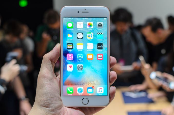
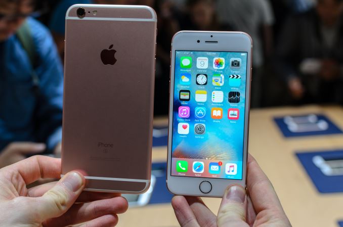
While the iPhone 6s and 6s Plus are relatively the same phone on the surface compared to the iPhone 6 and 6 Plus, in just about half an hour of hands-on time I actually discovered there’s quite a bit different that wasn’t even mentioned in the announcement, in addition to discovering the value of various aspects of what was discussed in the announcement.
The first, and probably most important change to the iPhone 6s from a user experience perspective this generation is going to be 3D Touch. After using it, I’m sure this will be widely adopted throughout the smartphone industry in about 18-24 months after the iPhone 6s. One of the major user experience problems I have with smartphones that isn’t necessarily obvious to most people is that there are a lot of actions that just break the flow of fluid user interaction. This may seem like a petty complaint, but a long press is probably the single most frustrating aspect of a smartphone user experience today. On Android, the standard for a long-press is usually around 500ms. This doesn’t seem like a long time, but if done repeatedly or if under time pressure half a second can start to feel like an eternity.
Another kind of flow-breaking that exists in smartphone user experience today is what I’d call ping-ponging. In short, this is the kind of user interaction in which you’re constantly opening one app to view one small thing before switching back to the application your focus is on. This is actually objectively bad for user focus, because humans are fundamentally not capable of true multitasking. Instead of doing multiple things at the same time, we’re just rapidly switching back and forth between tasks. Each context switch entails overhead, much like how making a CPU core switch processes invokes an overhead as state is saved and loaded.
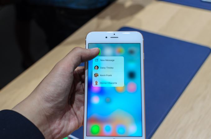
3D Touch is a novel way to tackle these two problems. In practice, 3D Touch means that you can do the equivalent of a long press on various app icons to expose options hidden behind a long press menu. However, instead of a long press, you just push slightly harder on the display to activate it so it happens as fast as you want it to be. The use of the Taptic Engine is actually quite helpful here as well, because it gives very obvious feedback as to what you can do with a force touch. If the app on a homescreen doesn’t support any options with 3D Touch, there’s a distinct double-tap to indicate this instead of a lot of pressing and wondering why nothing is happening. The speed at which you can do a force touch on the display means that 3D Touch gestures are just much faster and more user friendly than a traditional long-press.
In the other case previously described, 3D Touch is actually impressive because of how well it effectively eliminates a lot of the user experience inefficiencies that come with traditional multi-touch. Some of the key demos shown include peeking at emails with a medium-press, and opening them with a hard-press. In the case of the medium-press, you can look at an email with a single press quickly instead of tapping on the email, quickly reading it, then marking it unread and swiping back to the inbox. A hard-press opens the email completely so it isn’t necessary to release the finger and then do a light tap. In practice, this is actually a fluent gesture to make and I didn’t have any trouble with strange activation pressures. As far as I can tell though the pressure levels aren’t relative, so it’s fully possible to make a force touch equal to a light tap if you’re aggressive enough with the force touch gesture.
The email example is just one application, but probably one of the more obvious applications of this would be viewing links in a message thread and responding to IM within that thread. Without the ability to peek at links, each link would have to be opened in the browser with the associated loading times and before using multitasking to get back to the messaging application. In that time, it’s also possible that the messaging application would clear the message field so a half-written message could be lost to the ether. With 3D Touch, it’s possible to easily view links and other information in a message thread without losing focus.
It’s also possible to do a fast multitasking gesture by applying pressure while swiping from the left edge of the display, which allows a fast way of accessing the next app in the multitasking menu instead of pressing the home button. Overall, I think this is a pretty smart feature. It isn’t life-changing, but it’s definitely nice to have.
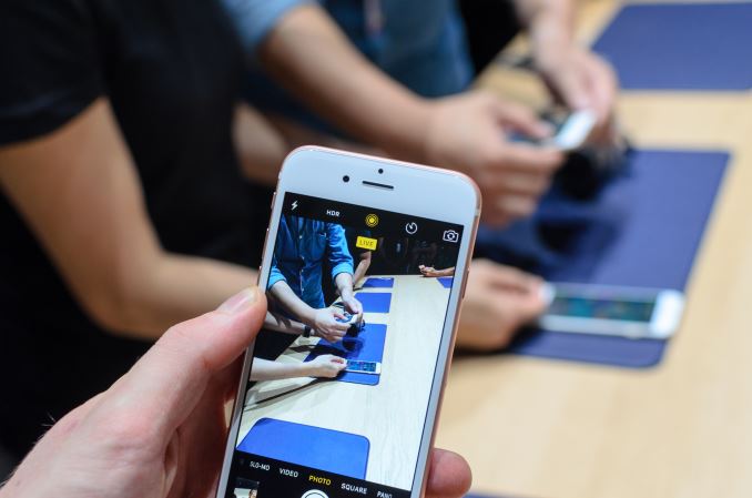
The other features that I could immediately get my impressions on were retina flash and changes to video recording. Retina flash sounds a bit over the top, but it’s really just a good way of using the display as a front-facing LED flash. LG has done this before to be sure, but Apple has implemented it in a way that the display gets much brighter than usual for a very short period of time. At least a few OEMs have implemented front-facing cameras with LED flash, but I have to say in my experience an LED flash with a front-facing camera is a painful experience because the light is strongly concentrated on a single point. I thought LG had a smart idea in the form of using the display as a front-facing LED flash as early as the G Flex 2, and given that Apple has adopted this idea as well it seems that someone at Apple thought so as well.
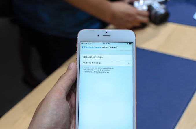
Although there was no way I’d be able to accurately say whether low light performance is comparable between the iPhone 6 and 6s, I did notice some changes to video recordings in the iPhone 6s. The first thing I noticed was that for slow motion video, 1080p120 is definitely supported. Additionally when recording 4K video there’s no time limit like in most phones, which is notable because in most phones the time limit is to ensure that SoC or camera sensor temperatures don’t exceed critical values. Live Photo seems like an interesting feature, but I really don't know what to think there as the functionality could easily go either way depending upon the intelligence there.
Outside of these small observations, it seems to me that the iPhone 6 Plus’ camera now enables OIS when recording video. When I tried to record video, it’s obvious that some kind of hardware stabilization is happening because the video was smoothed with the characteristic OIS jerkiness that I’ve seen in many phones that only use OIS in video. In my experience, the iPhone 6 while recording video appeared to not have any video stabilization at all while once recorded much of the jitter and shake was removed from the video. I didn’t get to examine the recorded video too closely, but I suspect the electronic video stabilization will help to smooth out the inherent jerkiness of OIS in video alone.
Overall, I found the iPhone 6s lineup to be relatively promising in terms of new features like 3D Touch and performance with nothing that seemed wrong. However, as the smartphone market continues to mature it’s no longer enough to just rely on a short hands-on to identify potential pitfalls. In order to really understand the iPhone 6s lineup and the problems that it might have a full review is necessary.




74 Comments
View All Comments
Buk Lau - Wednesday, September 9, 2015 - link
how distinguishable are the force levels?JoshHo - Thursday, September 10, 2015 - link
They're distinctly different levels of activation. I suspect we'd need to use metal slugs to really determine what the activation levels are. The haptic feedback for 3D touch is distinct.ltcommanderdata - Wednesday, September 9, 2015 - link
https://www.apple.com/iphone/compare/The spec sheets for the 6s Plus confirms OIS for video.
How discoverable and/or standardized are the 3D Touch options though? I don't want to have to try every button in different apps to see if they offer long press, medium-press, and hard-press options and find out what they do.
tuxRoller - Wednesday, September 9, 2015 - link
The whole force touch thing seems really fiddly, especially (as arstechnica reports) since long touch is still enabled. They were also claiming that some people still had problems using force touch after extended experience with it. Not too surprising, and definitely an avenue worth looking at, but for now it looks to be too difficult for the average consumer.dsumanik - Thursday, September 10, 2015 - link
Lol, gotta love how anandtech writes such an in depth revelation about force errrr 3d touch.Dudes.... Wake up......it's essentially the touch version of a right or middle mouse click.....not a revelation.
Wanna impress me?
Where's the haptic feedback and texture morphing surface we been hearing about for years, seeing patents filed for? 3d touch implies it senses distance/position from screen surface, could definitely see some new handy pull away/ hovering gestures from something like that.
All said and done the new iPad pro looks pretty badass, just don't like the weight I'll wait for iPad Air pro probably, iPhones are totally meh and they need to up the display...1080p is friggin 2012.
Also why no 4k Apple TV? Especially in light of 4k recording on iPhone. That right there is the difference between jobs and cook, jobs made the magic by making the devices all work with each other.
I see what like ....8 iPad models now all doing the same thing? Get it together Cupertino. I need a new phone bad, I've been apple since the 3G but for the price, I'm just not feelin it this fall apple, sorry.
edzieba - Thursday, September 10, 2015 - link
"Where's the haptic feedback and texture morphing surface we been hearing about for years"Waiting for stretchable (not just one-axis flexible) substrates for electronics to be developed to the state that they are viable for commercial processes.
osxandwindows - Thursday, September 10, 2015 - link
Why have a 4k apple tv?, you can have a 21.4 inch iMac, it has a way larger SSDGigaplex - Friday, September 11, 2015 - link
21.4 inches is rather small for a TV.sor - Friday, September 11, 2015 - link
I see what you mean about right click in the sense that it offers a way to touch the same point but get different results, but the use cases and functionality enabled are quite different, and for good reason. On larger screens where you have a mouse, you have screen real estate to have a mail preview window, for example, so there's no need to preview messages via right click.I've been a nexus guy for the past few years, but this feature actually has me thinking about switching, if it is implemented well. Yes, its not revolutionary to have different kinds of clicks, but having the user experience streamlined in an easy and intuitive way seems nice. I'm pretty tired of long pressing when typing numbers, going back and forth between apps, clicking and opening each conversation to find the one I want after narrowing with search, etc. There are just a lot of things that are still clunky to do on a phone, and this seems like it has the potential to make many of those things more natural. All pending that they got it right, of course.
An article I read a few days ago was concerned that the new input may muddy the waters a bit. An example was having a force touch delete an email in one app, but select an email in another. I thought it was interesting that Apple seems to have tackled this via the "peek" and "pop" guidelines. Ultimately I imagine app developers can do what they want with the inputs, but the push seems to be to leverage them as universal preview and open functions. Then there's the edge force which is also universal because its an OS level function for task switching.
ejwu - Wednesday, September 9, 2015 - link
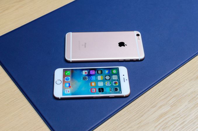
Does anyone know where I can buy those blue mats on the table? It looks like leather but it's really soft.